M.C. Escher: A Printmaker First
The techniques behind M.C. Escher's prints — woodcut, wood engraving, linocut, lithography and mezzotint — seen from a visit to his museum in The Hague.
While I was living in Amsterdam, I took the train down to The Hague. It wasn’t my first time in the city — I’d gone with no real agenda beyond walking around with a camera, following the light, seeing what I’d find. What I found, without meaning to, was M.C. Escher.
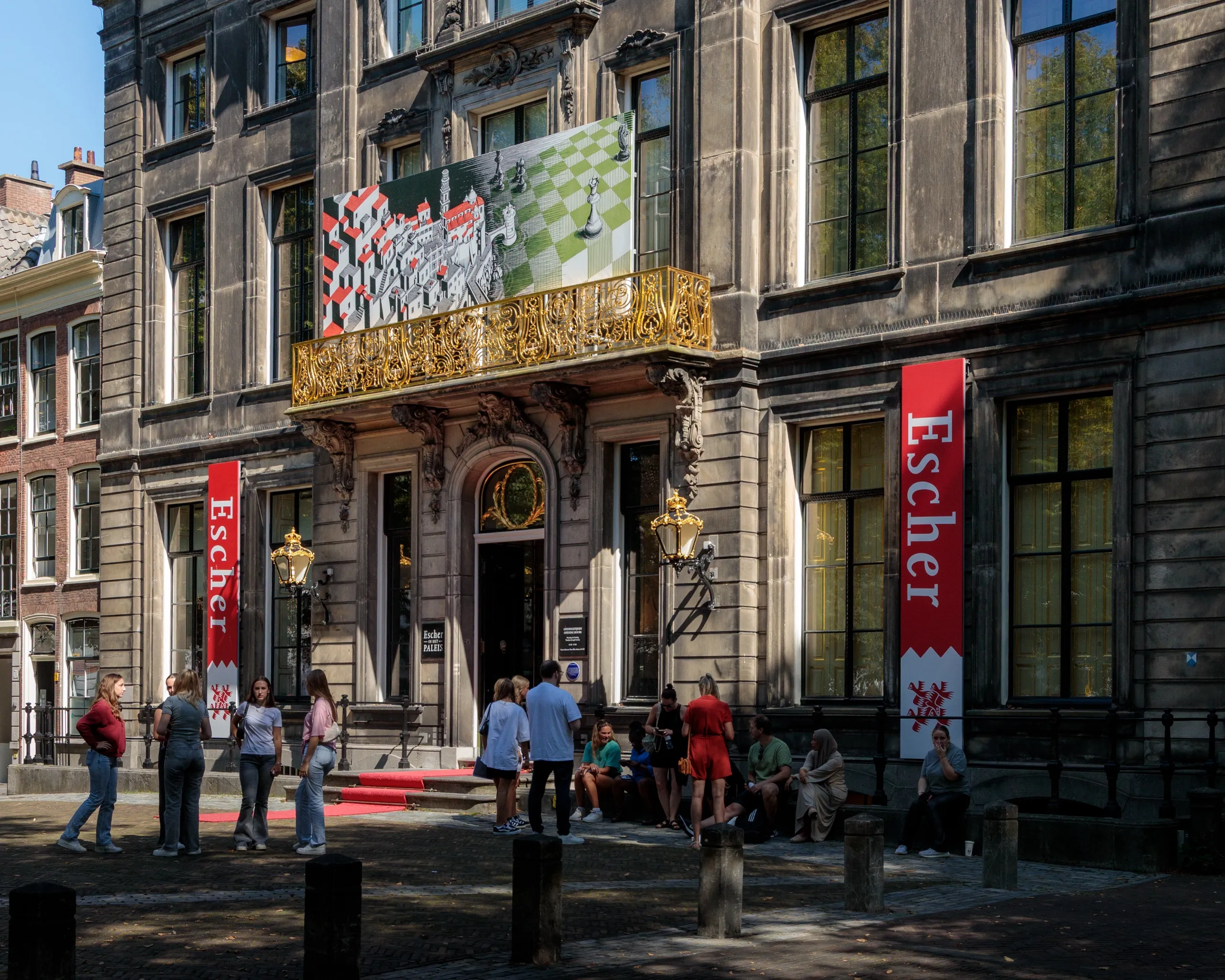
You come along the Lange Voorhout, one of The Hague’s grand, tree-lined avenues, and you can almost walk straight past the place — a sober eighteenth-century stone façade set back behind the trees, a gilded balcony, a few people resting on the step. Only the tall red banners give it away. This is Escher in Het Paleis: a museum devoted entirely to Escher, set inside a former royal winter palace that once belonged to Queen Emma. I wandered in on a whim, realised where I was standing, and gave the rest of the day over to it.
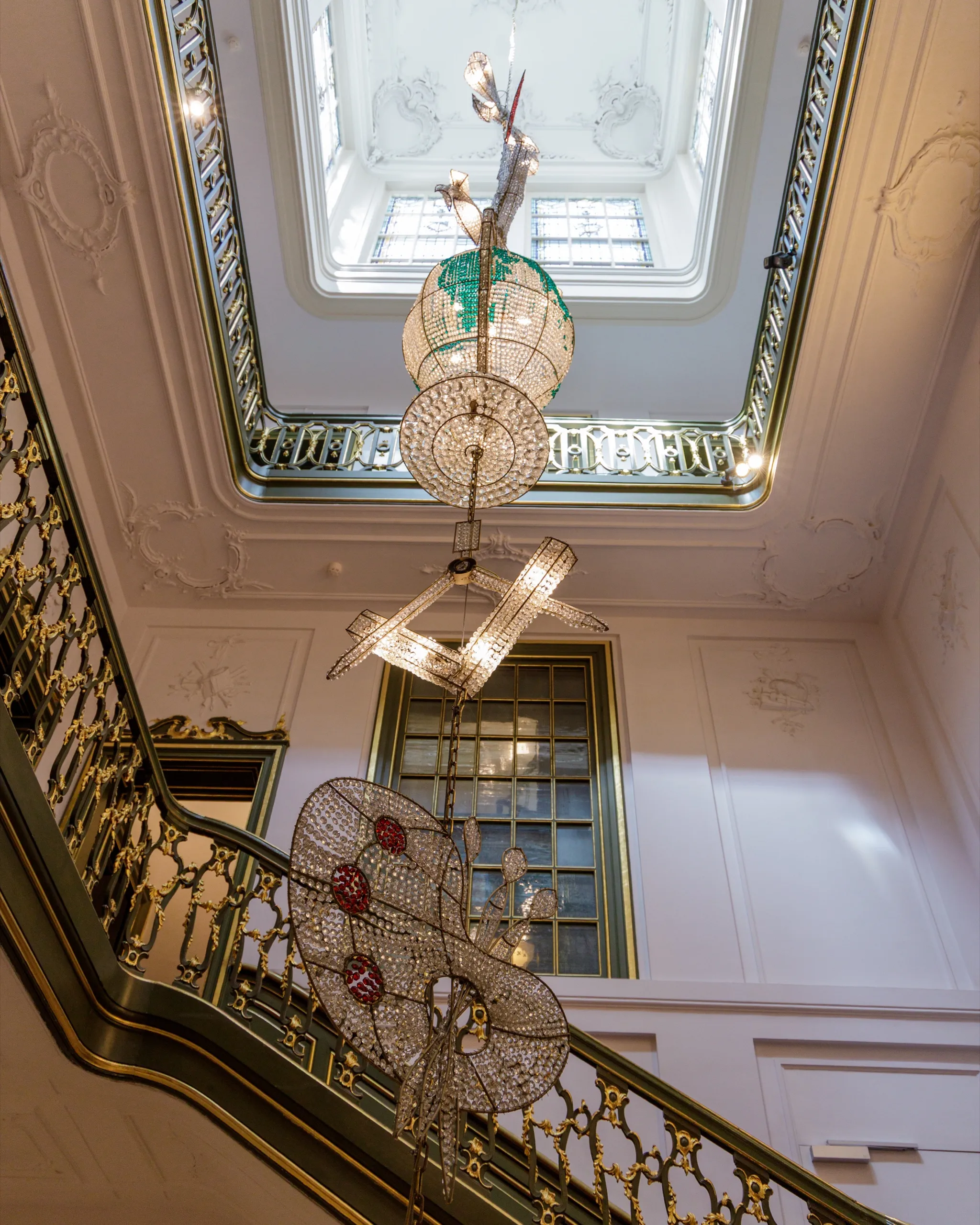
Inside, the gilded royal rooms have been hung with fifteen crystal chandeliers by the Dutch artist Hans van Bentem — a skull, a globe, an umbrella, a star. I spent a good part of the visit looking at the ceiling. But the walls hold the woodcuts and lithographs themselves, and that is the quiet fact all the crystal nearly distracts you from. For all the impossible staircases, the interlocking birds, the hands that draw themselves, Escher was, first and foremost, a printmaker. Every strange thing he is known for was cut, drawn, or scraped into a physical matrix — wood, stone, copper — and pulled onto paper by his own hand or under his close watch. He worked across five techniques in three families, and the technique was never just a way of delivering the picture. It was the artwork’s condition of existence.
And here is the part that matters most to the way we think about prints. For Escher, the print was not a reproduction or reuse of any image existing elsewhere. There is no painting of Relativity in a vault for which the print stands in as a copy — the print is the original, the only place the work has ever fully existed. He went to some trouble, near the end of his life, to keep it that way.
A museum inside a royal palace
The building deserves a moment of its own. Queen Emma used the house as her winter palace from 1901 until her death in 1934, and after her a succession of Dutch queens kept their offices here; the Escher collection only moved in in 2002. It makes for an odd, happy match — a museum of geometric impossibility housed among gilded cornices and parquet, one room floored by the American minimalist Donald Judd.
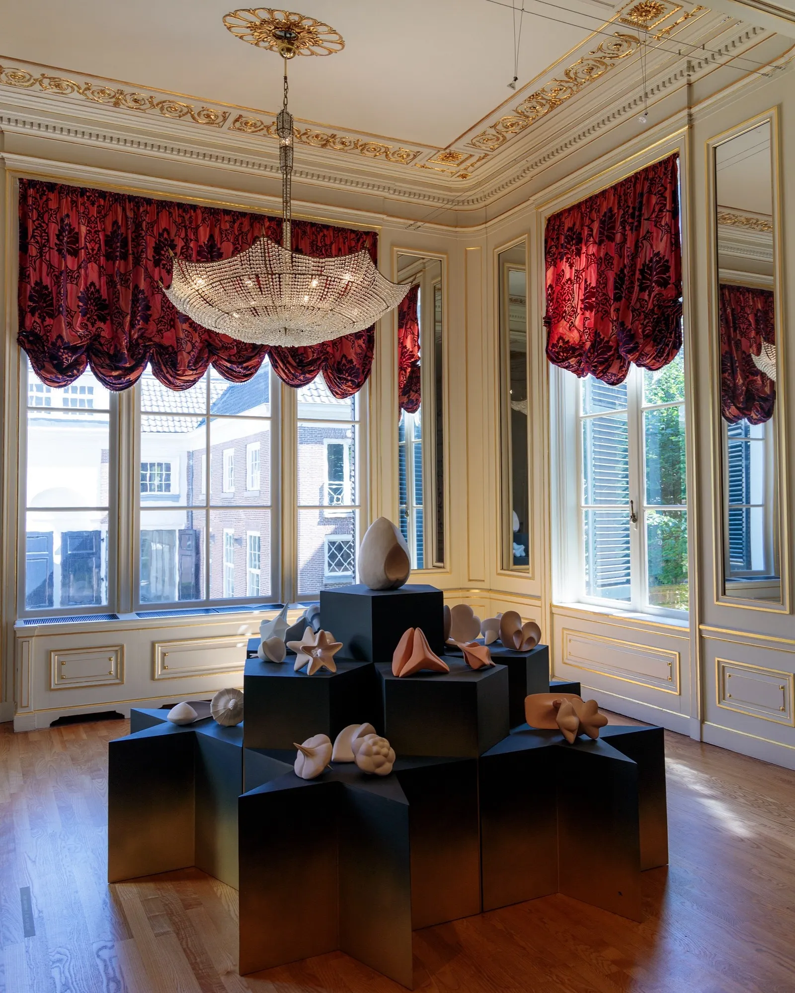
What the museum does with those rooms is the part I keep turning over. Instead of stripping the palace back to gallery white, it leaned into the contradiction and had Van Bentem hang the royal rooms with crystal chandeliers — shapes lifted half from the palace’s own plaster ornament, a pair of compasses and a bow, and half from a stranger register, a spider, a seahorse, a shark. In the mirrored ballroom a great faceted star hangs between two facing mirrors and repeats itself down an endless corridor of reflections. Escher spent much of his life chasing that exact sensation — infinity, reflection, a pattern with no edge — on flat paper. Here it was overhead, in glass.
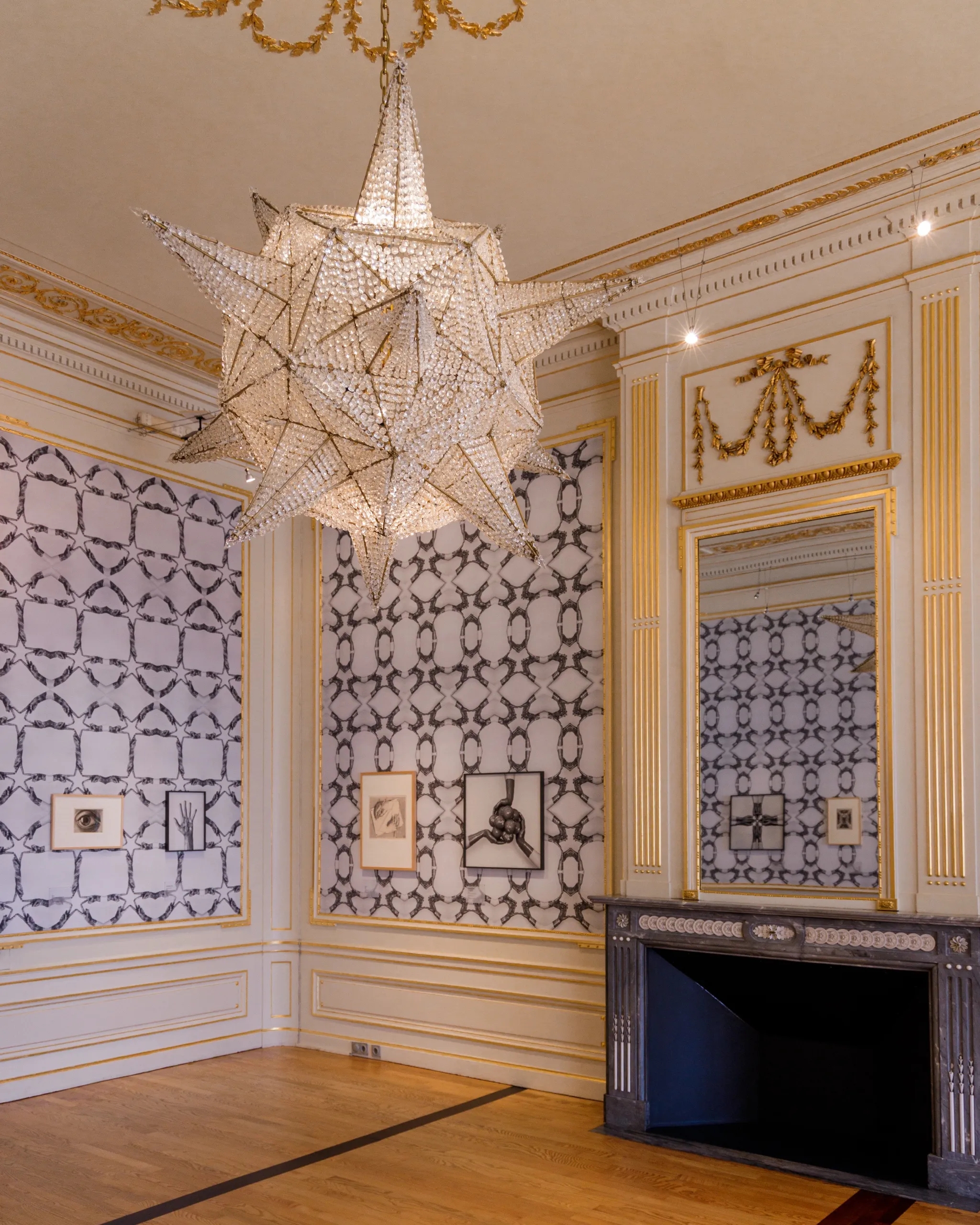
And that star is the cleanest way in to how he actually worked. The one above my head was assembled by a Czech family of glassmakers. But the star that turns up in Escher’s own work — the impossibly faceted cage at the centre of his 1948 wood engraving Stars, two chameleons clinging inside it — he made the slow way, cutting it line by line into the end grain of a block of wood. None of his images simply appeared. Each began as a surface someone had to carve, draw on, or roughen by hand — which is exactly how his five techniques sort themselves out.
What techniques did M.C. Escher use?
Across roughly 448 prints made over some sixty years, Escher worked in five techniques, and they belong to three different families of printmaking: relief (woodcut, wood engraving, and linocut), planographic (lithography), and intaglio (mezzotint). The families are not just a filing system. Each one asks the artist to do something physically different to a different material — cut away, draw on, or dig into — and each leaves its own signature in the finished sheet. Escher moved among all three, reaching for whichever would give a particular image the surface it needed. The easiest way to feel the differences is to follow him through them in the order he took them up himself — so let’s start where he did.
Relief: cutting the surface away
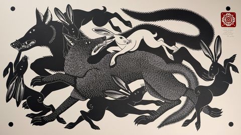
Relief is the oldest idea in the medium: carve away everything you don’t want, ink what remains standing, and press paper to it. Whatever you cut drops below the ink and stays white; whatever you leave behind prints. Escher started here. His first print, in 1916, was a linocut portrait of his father — linoleum being the forgiving way in, softer and quicker to cut than a block of wood.
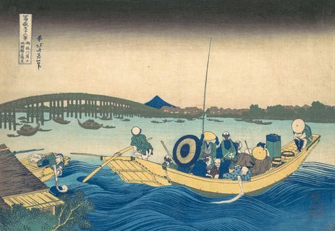
He soon moved to the wood itself, and the woodcut stayed one of his primary tools for the rest of his life. Cut along the plank grain with a gouge, it gave him the bold, interlocking shapes of the works most people picture first: the transforming towns and creatures of Metamorphosis I (1937), the birds that turn into fish in Sky and Water (1938), and, at the very end, Snakes (1969) — his final print, so exacting that he cut three separate blocks and ran each through the press three times, nine passes in all, to close its ring of interlocking rings without a single gap.
Wood engraving is the woodcut’s finer sibling, and the difference is really just which part of the tree you cut. A woodcut is carved into the side of a plank, the grain running the length of it like the face of a floorboard — easy to cut, and made for bold, clean shapes. Wood engraving uses the block the other way round: instead of the plank, the artist cuts into the end — the dense, sawn-across face you’d see on the top of a tree stump — which is even enough in every direction to hold a hair-fine line. That fineness is what let Escher pack the faceted cage of chameleons into Stars (1948). He had come to printmaking at all through his Haarlem teacher and lifelong mentor Samuel Jessurun de Mesquita — the graphic artist who saw the young architecture student’s early prints and talked him into switching to the graphic arts for good. What matters about this whole family, though, if you are the one who ends up owning the sheet, is who did the pulling: Escher printed his relief blocks himself, by hand, and often wrote eigen druk — “my own printing” — in the margin to say so. The paper didn’t just carry his design; it came off the press under his own hands. If you want the mechanics in more depth — the grain, the gouge work, the marks a relief block leaves pressed into the paper — our guide to the woodcut follows the technique from Dürer through the Japanese ukiyo-e masters to the present day.
Planographic: drawing on the stone
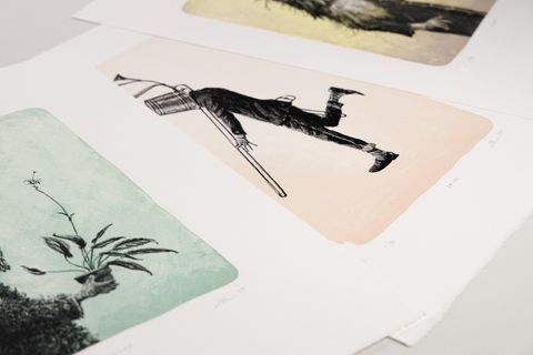
If relief is about cutting away, lithography is about not cutting at all. The surface — traditionally a slab of fine limestone ground perfectly flat — is never carved into. The artist simply draws on it, with a greasy crayon or ink, and the technique runs on a piece of chemistry any cook knows: grease and water don’t mix. The greasy drawing holds the printing ink; the dampened blank stone repels it; press paper to the stone and only the drawing comes away. The method was worked out in the 1790s by a German actor, Alois Senefelder, who was looking for a cheap way to print his own playscripts and stumbled onto one of the great printmaking techniques instead.
For Escher, the appeal of lithography was tone. Because he was drawing rather than carving — pressing harder or softer, shading, hatching, blending — a lithograph could hold a continuous scale of greys that a knife in a block never can: the soft, velvety transitions a cut line can’t make. That control is what makes the illusions convincing. The unbroken slide from light to shadow is exactly what lets your eye believe, for a moment, that the water in Waterfall (1961) is running uphill, or that the monks in Ascending and Descending (1960) are climbing a staircase that only ever rises. Relativity (1953), Drawing Hands (1948), and the self-portrait he made in his Rome studio in 1935 — Hand with a Reflecting Sphere, the whole room bent around him in a mirrored ball — are all lithographs, all built on that complete grey scale.
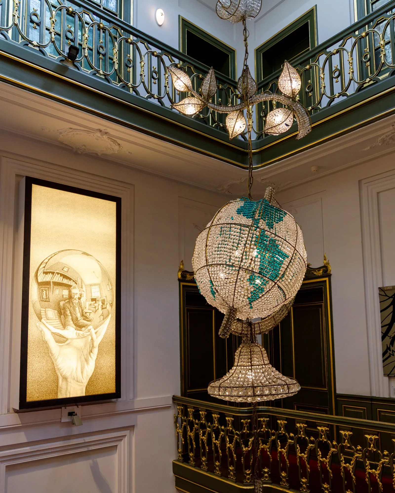
And here the question of who actually makes the print quietly turns over. Escher printed his own woodcuts and engravings by hand — eigen druk — but he did not print his own lithographs. He prepared the stone himself, drawing the image, then handed it to a carefully chosen professional lithographer to run through the press, standing over the work to check that every sheet came out as he intended. That difference — the artist who cuts and prints his own block, versus the one who draws the image but trusts the pulling to a specialist under his eye — isn’t a technicality. It’s close to the centre of how you read any print: how much of the object came from the artist’s own hand, how much from someone else’s, and under what supervision. If you want the mechanics behind it, our lithography guide walks through how a stone is drawn, proofed, and pulled, and what a lithograph actually is is the short version if you just need the essentials.
Intaglio: digging into the plate
The third family inverts the first. Relief prints from the surface that’s left standing; intaglio prints from the marks cut below it. The image is incised, bitten, or roughened into a metal plate — copper, usually — then ink is worked down into those recesses and the smooth surface wiped clean. Damp paper, pressed hard under a heavy press, is forced into the grooves to draw the ink back out. You can often feel the result afterwards: a faint ridge of raised ink, and the rectangular plate mark that the plate’s own edges stamp into the paper. Engraving, etching, drypoint, aquatint, and mezzotint all belong here. Escher’s contribution to the family was the last and strangest of them.
Mezzotint runs the whole logic backwards. Where the other techniques add the marks that will print, mezzotint starts from solid black and works toward the light. The printmaker takes a rocker — a wide, curved blade with fine teeth — and rocks it across the bare copper over and over, pass after pass from every direction, until the entire plate bristles with tiny burrs. Inked at that stage, it would print a deep, even, velvety black. The image is then found by taking away: scraping and burnishing those burrs down where the light should fall — a little for grey, back to smooth copper for white. The name admits as much — mezzo, half; a picture built entirely from half-tones. Nothing else yields blacks so dense and so luminous at once, and Escher wanted them. He came to it late, making his first mezzotint in 1946, and made only eight in the end — among them Eye (1946), where one burnished highlight lifts off the upper lid. The cost is built into the method: the soft copper wears with every pass, the burrs flattening and the blacks fading, so none of his mezzotints was editioned above fifty, and each cost him a great deal of painstaking work for a very few good sheets.
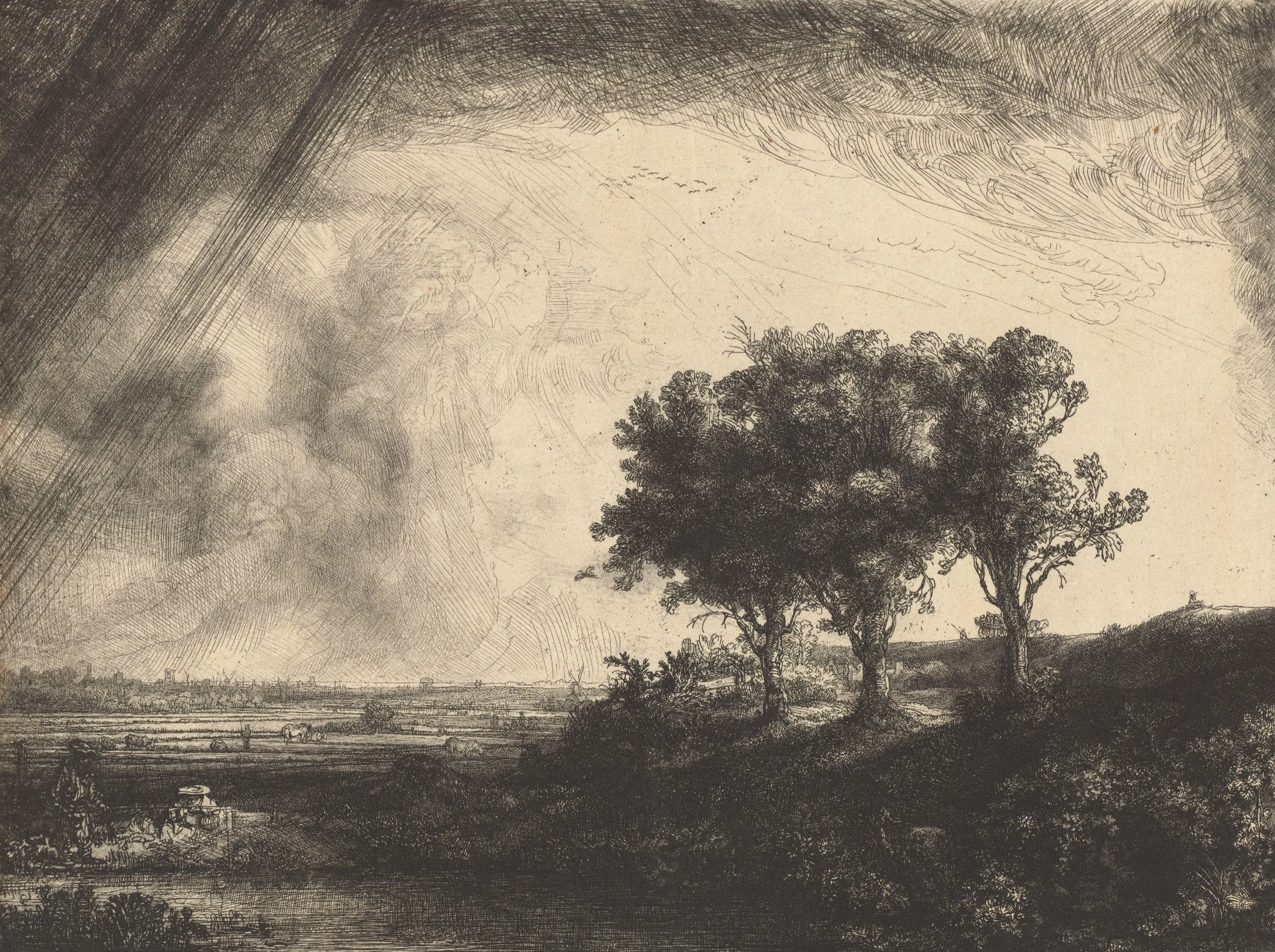
There’s a quiet Dutch thread worth pulling here. The Netherlands has as deep a claim on intaglio as anywhere: mezzotint was invented in the seventeenth-century Dutch world, by Ludwig von Siegen, and in those same decades Rembrandt was in Amsterdam turning etching into some of the most tonally dramatic prints ever pulled. Escher, a Dutch printmaker three centuries on, was reaching back into that same inheritance. I can’t show you his own mezzotints — like all his work, they remain under copyright, and the place to see them is the museum itself — so the figure below is Rembrandt’s instead: an etching, intaglio worked as line rather than tone, and a reminder of how far back the Dutch claim on this family of prints runs. The acid-bitten line has a longer history than Escher’s eight plates suggest, and our etching guide traces it — from an armourer in Augsburg around 1500, through Rembrandt’s own three hundred-odd plates, to the zinc and ferric chloride of a present-day studio.
The print as the original
I said at the start that Escher went to some trouble, near the end, to keep the print the original. Here is the trouble. When he died in 1972, his printing surfaces — the lithographic stones, the copper mezzotint plates, the linoleum blocks, and most of the woodblocks — were destroyed, at his own request. A limited edition is only ever as limited as its matrix allows: leave the stone or the block intact and, in principle, more can always be pulled. Escher closed that door for good. With the matrices gone, the editions could never be reopened, never quietly extended, never “completed” by an estate after the fact. What exists is what exists.
That decision is worth sitting with, because it runs against what the popular Escher leads you to expect. For most of the art we learn to think about, the original is a single object — a painting — and a print is a reproduction of it, a way of carrying the image out into the world more cheaply. Escher’s work runs the other way. There is no painting of Relativity, no canvas of Drawing Hands somewhere of which the prints are copies. He composed directly for wood, stone, and copper; the print is not a picture of the work, it is the work — the only form it was ever meant to take. Original versus reproduction was never a hard call with Escher, because there is nothing else for the print to be a reproduction of.
That is the whole distinction Paper Matters is built on, drawn in its cleanest possible line. An original print is a work conceived as a print — pulled from a matrix the artist actually worked, not photographed from a painting and run off an inkjet. Escher pushes that idea as far as it goes: no source image, no shortcut, his own hand on most of the plates and blocks, and, at the last, the matrices destroyed so the edition could never be faked or extended. If you want the ground under that claim, we set it out elsewhere — what actually separates a real print from a reproduction, how edition numbers and a closed matrix protect what you own, and why any of this matters to us in the first place.
I left the museum in roughly the state those chandeliers had put me in — head tilted, half the visit spent looking up. But what I carried out was down on the walls, at eye level, in modest sheets of black and grey: the plain proof that a print need not stand in for anything, that it can simply be the thing itself. Escher knew that. He worked his whole life as though it were obvious — and then, with the stones and plates and blocks gone, he made sure it would stay that way.
Related materials