TECHNIQUE · GUIDE
Lithography
A collector's guide to lithography: what a lithograph is, how it's made, how to recognise an original, and why the technique still matters.
A lithograph is a print pulled from a drawing — not from a carved wood block or an incised metal plate, but from a flat stone or plate where the artist has drawn the image directly, in greasy materials like crayon, tusche, or oil-based ink. The print is taken from that drawing using a simple bit of chemistry: grease attracts ink; water repels it. That makes a lithograph a planographic print — distinct from a woodcut (carved in relief) or an etching (incised below the surface).
In practice, the word gets stretched well beyond that definition. It turns up on original prints, on decorative posters, and on photo-offset reproductions of paintings, often with no clear marker telling one from another. The distinction matters — it affects collectibility, and gets easier to recognise once the underlying technique is understood.
Below, we look at where lithography came from, how it’s made today, and what to look for when the word turns up on a label, a certificate, or a wall. For a closer walk-through of the definition itself, see what is a lithograph.
Where lithography came from
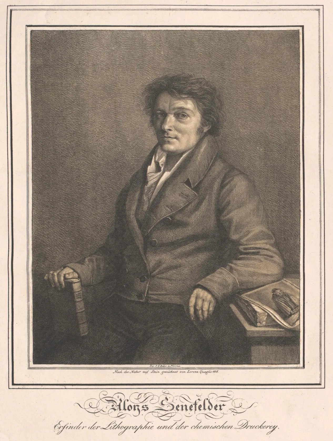
Lithography was invented in 1796 by Alois Senefelder, a Bavarian playwright and actor looking for a cheap way to print his own plays. He noticed that an oily ink, drawn onto a piece of locally quarried Solnhofen limestone, would refuse water and accept ink — making it possible to take repeated impressions of the drawing without carving anything. Senefelder spent the next two decades refining the technique. In 1818 he published Vollständiges Lehrbuch der Steindruckerey — a complete instruction manual for the process, translated into English the following year as A Complete Course of Lithography.
The chemistry he worked out is the chemistry every original lithograph uses today. Stone has been joined by aluminium and zinc plates; tusche and oil-based crayons have been refined; presses have been redesigned. But the underlying principle — grease draws ink, water repels it, and an image drawn directly on a flat surface can be reproduced from that drawing without carving — hasn’t changed. That is what makes a print a lithograph in any meaningful sense, and it’s why an offset reproduction, where the image is transferred photographically rather than drawn, sits in a different category regardless of what its label says.
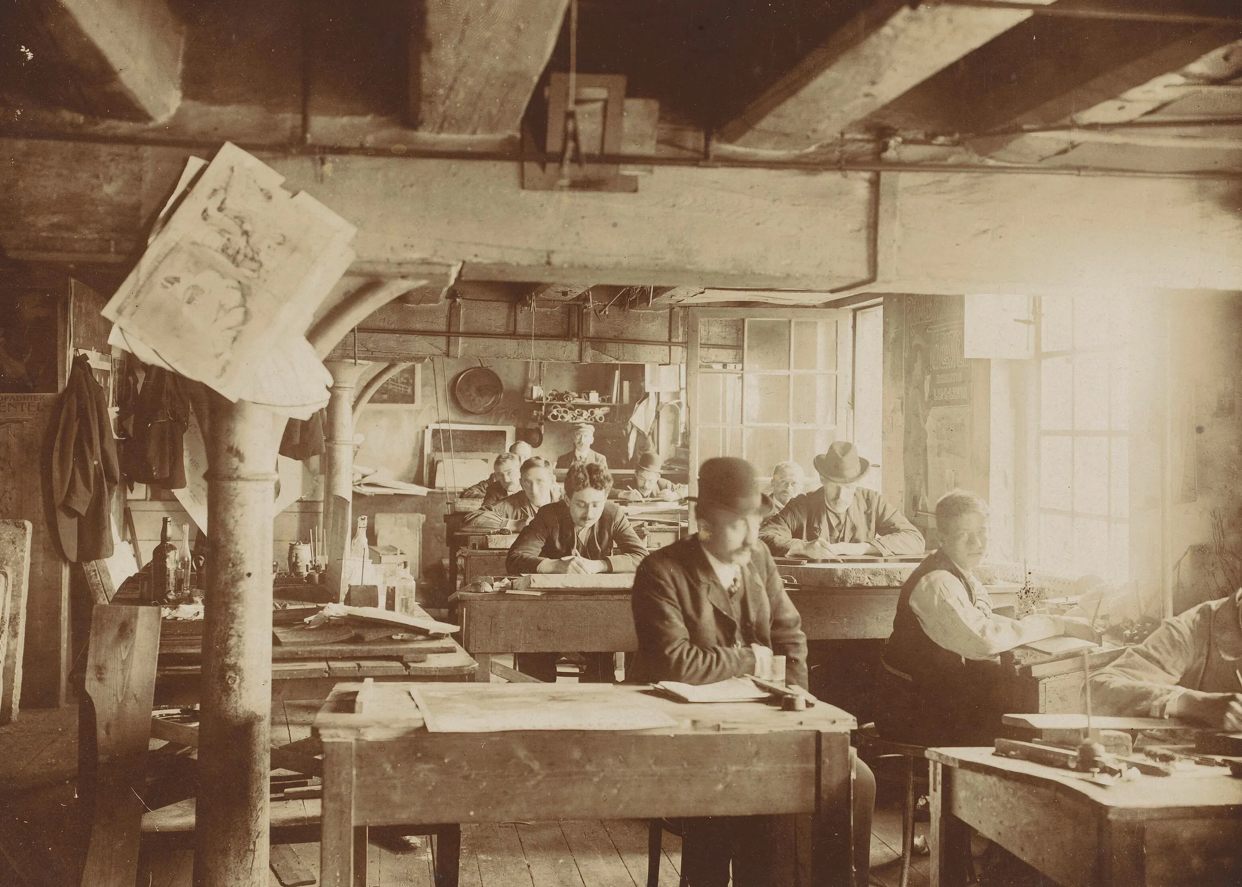
By the mid-twentieth century, hand-pulled stone lithography had nearly disappeared in the United States, displaced by commercial offset printing. What brought it back was an institutional intervention out of Los Angeles in 1960.
How Tamarind brought it back
By the late 1950s, an American artist who wanted to make a serious lithograph had a problem: there were almost no master printers left in the country to make it with. Commercial offset had absorbed most working lithographers, and the discipline of hand-pulled fine-art lithography — the artist drawing on the stone, the master printer pulling the edition — had drifted out of American practice. June Wayne, a Los Angeles painter and printmaker, ran into the problem directly: when she wanted to produce a series of lithographs in the 1950s, she had to travel to Paris and work with the printer Marcel Durassier.
In 1959 she wrote a grant application to the Ford Foundation proposing to fix it. “A handful of people is all that is needed for a renaissance in an art,” the application read. “Such a renaissance is the purpose of this project.” The Ford Foundation funded her for $165,000 over three years, and in July 1960 the Tamarind Lithography Workshop opened in Los Angeles, named after the avenue where Wayne’s studio sat. Its first technical director and master printer was Garo Antreasian, a printmaker from Indianapolis who took a year’s leave from his teaching position at the Herron School of Art.
The workshop’s method was deliberate. Artist fellowships brought painters and printmakers to Tamarind to work for several months alongside trainee master printers, each pair learning the technique through actual collaboration on real editions. Over the next decade Tamarind hosted Ed Ruscha, Josef and Anni Albers, David Hockney, Philip Guston, John McLaughlin, Ruth Asawa, and Matsumi Kanemitsu, among many others. Just as importantly, the workshop turned out trained master printers who carried the practice into other workshops. Kenneth Tyler apprenticed under Antreasian starting in 1963, became Tamarind’s technical director within a year, and left in 1965 to found his own shop — which by 1966 had become Gemini G.E.L. in Los Angeles, where Robert Rauschenberg, Jasper Johns, and Roy Lichtenstein would pull lithographs through the late 1960s and beyond.
In 1969 the Museum of Modern Art mounted Tamarind: Homage to Lithography, 150 prints from the workshop’s first nine years. By 1970, when the original Ford Foundation funding had run out, Tamarind moved from Los Angeles to the University of New Mexico in Albuquerque under its second director, Clinton Adams, and was renamed the Tamarind Institute. The next year, Antreasian and Adams published The Tamarind Book of Lithography: Art and Techniques — 464 pages on every stage of stone and plate work, the underlying chemistry, the workshop’s documentation methods, and what it took to pull an edition correctly. It remains the canonical English-language reference on the technique.
How a lithograph is made
A collector doesn’t need to know every chemical step that the Tamarind Book covers. The shape of the process matters, though, because it’s where the difference between an original lithograph and a reproduction actually lives.
It begins with the artist. The image is drawn directly onto a flat surface — historically a slab of Solnhofen limestone, now also aluminium or zinc plates ground to take a similar grain — using greasy materials: a tusche wash, a crayon, an oil-based ink. The drawing is not carved or incised. It sits on the surface.
A master printer then treats the matrix with an “etch,” a syrupy mix of gum arabic and a small quantity of nitric acid. The etch does not bite into the stone the way an etching needle bites into a copper plate. It bonds the greasy drawing chemically to the surface and desensitises the undrawn areas so they will hold water and reject ink. Before printing, the original drawing is largely wiped away with solvent and replaced with a thin asphaltum film — a ghost of the drawing that carries the ink in its place.
For each impression, the printer dampens the matrix with a sponge, then passes an ink-charged roller over it. The dampened areas refuse the ink; the asphaltum-coated drawing accepts it. A sheet of paper is placed on the matrix and run through a flatbed press, where the pressure transfers the ink to the paper. The matrix is re-dampened and re-inked between sheets, and each impression is pulled — the term collectors will see on certificates and catalogue entries — one at a time, by hand.
The thing that distinguishes an original lithograph from anything labelled “lithographic” is at the start of that sequence: the image is drawn by — or in close collaboration with — the artist. A photo-offset reproduction skips the artist’s drawing entirely. The original sits at the head of the process; the reproduction is what happens when the process is severed from the hand.
Recognising a lithograph in the wild
The visible markers a collector uses to read a lithograph live almost entirely in the margins, below the image. They are unusually consistent across the last century of fine-art lithography — once familiar, they are easy to read.
The signature comes first. An original lithograph is signed by the artist in pencil, almost always in the lower right margin below the image. Pencil is the convention because it cannot be mechanically reproduced; a signature inside the image plane was printed with the rest of the sheet and tells you the artist’s hand never touched this one. The edition number sits in the lower left margin, also in pencil, in the form X/Y — a print numbered 76/120 is the seventy-sixth impression from an edition of one hundred and twenty. A short essay on reading edition numbers covers the full vocabulary, including artist’s proofs and hors commerce impressions.
Most fine-art lithographs also bear a publisher’s or printer’s chop — an embossed stamp in the lower margin identifying the workshop that pulled the edition. The Tamarind Institute uses an alchemist’s symbol for stone, and has done since 1960; every Tamarind print bears it, plus the personal chop of the printer who pulled the impression. Other workshops use their own marks.
The paper is the last visible indicator. A serious lithograph is pulled on a serious sheet — Arches, Rives BFK, Somerset, Japanese mulberry — chosen for how it accepts ink and how it will age.
None of this guarantees authenticity by itself; provenance and catalogue raisonné research handle the harder cases. But the signature, the edition number, the chop, and the paper, taken together, are how a collector reads a lithograph at first encounter. They are what distinguishes a print made by hand from a reproduction printed mechanically, now visible in the object itself.
Lithography in our collection: Ethan Murrow
Lithography is a living practice, not a historical one — and the clearest way we can show that is with work we hold.
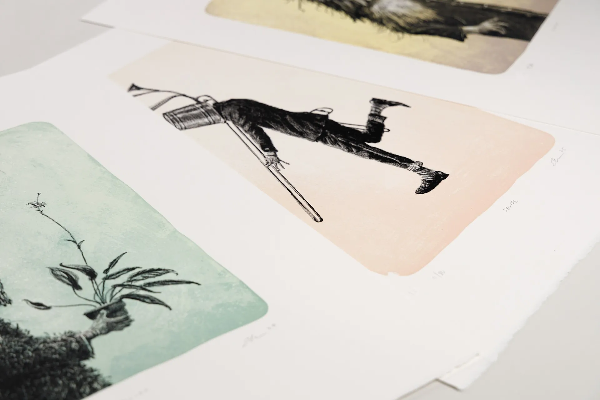
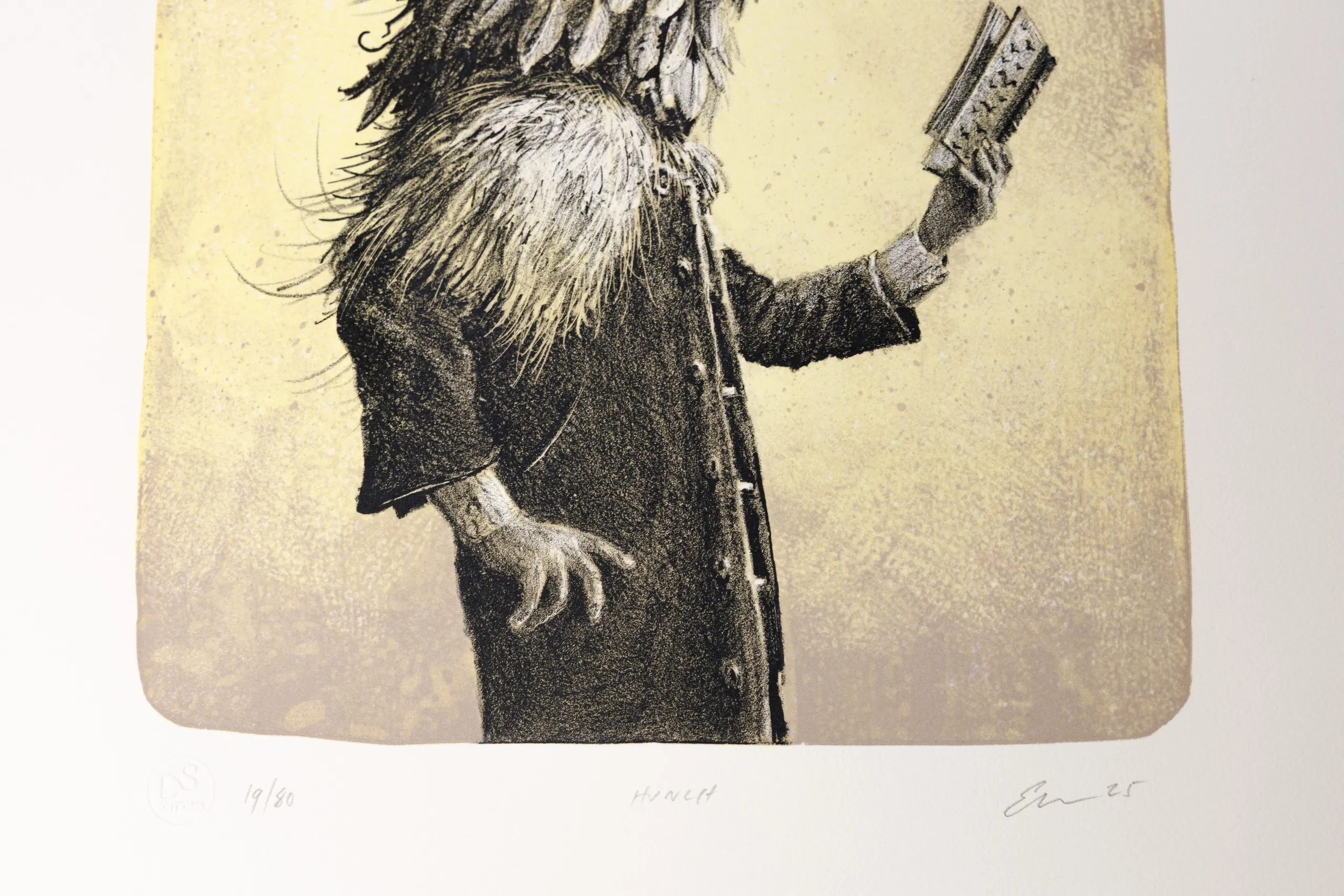
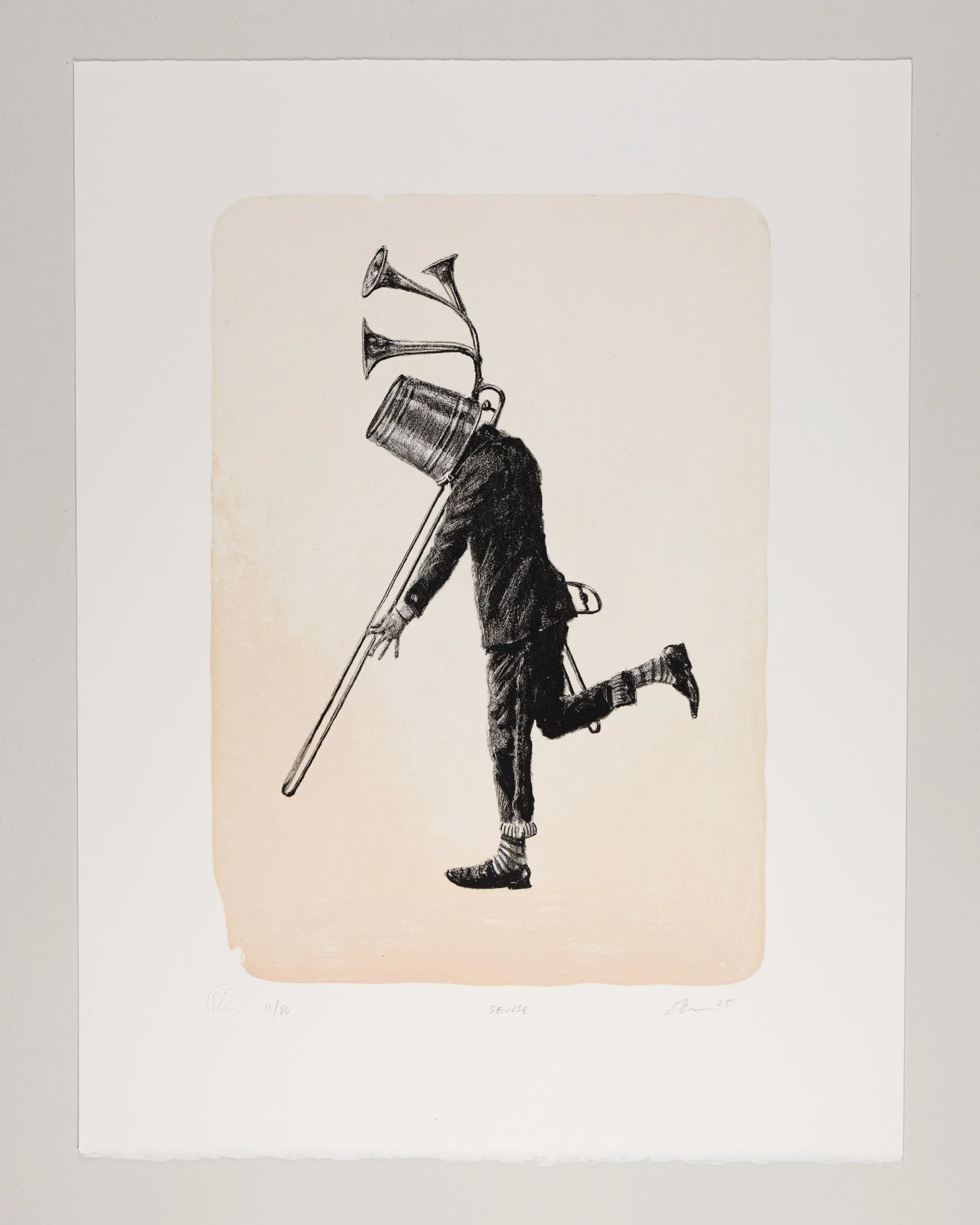
Ethan Murrow, raised on a sheep farm in Vermont, is a contemporary artist whose drawings, murals, and prints turn on the awkward, often absurd ways humans occupy the landscape. In 2025 he produced a set of three stone lithographs — Hunch, Sense, and Belief — in editions of eighty, at D&S Fine Art Editions. We hold all three.
They are stone lithographs of the most traditional kind: each image drawn by Murrow on limestone, each colour carried by a separate stone, hand-registered and hand-pulled — three colours for Sense, four each for Hunch and Belief. They were printed in Paris on a Voirin flatbed press, at a studio co-founded by Deb Chaney, a Tamarind Master Printer whose craft descends directly from June Wayne’s 1960 workshop.
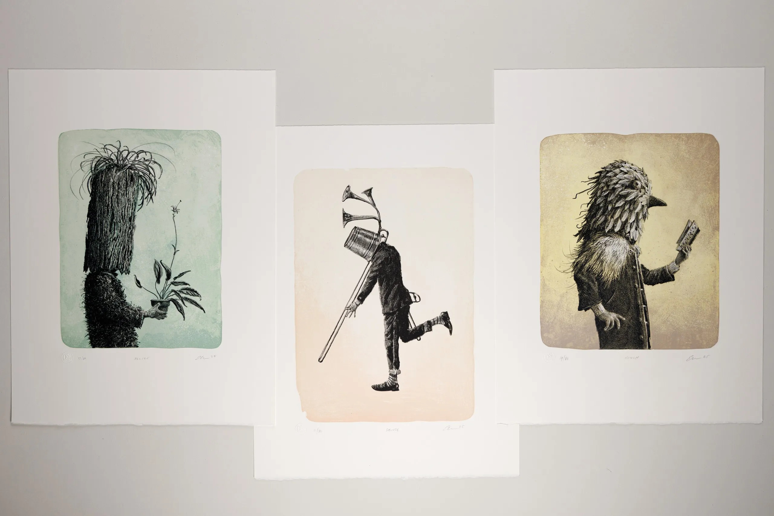
The images come from a body of work about mimicry and transformation — masked figures reaching toward connection, sometimes sincerely and sometimes foolishly. Each of the three is a solitary figure: one bird-headed, peering at a small book; one with a horn-sprouting bucket for a head, caught mid-stride; one buried in shaggy fronds, tending a potted plant. What holds them together as a set isn’t a repeated character — each figure is different — but Murrow’s exacting hand, a shared deadpan whimsy, and three soft fields of colour that sit easily side by side.
If these stay with you the way they did with us, the Ethan Murrow profile is where to go next — his wider practice, the exhibition behind these images, and a closer look at the prints themselves.
Where to go from here
Lithography rewards a close look. Once the principle is clear — an image drawn on a flat surface, printed because grease and water won’t mix — the rest is learning to read what’s in front of you: the marks, the margins, the chop, the paper. That kind of attention is at the heart of collecting well, and it’s entirely learnable.
If you want the definition on its own, we lay it out in what makes a print a lithograph. We’re adding closer looks as we go — the difference between a stone lithograph and a plate, and how to read a single sheet up close. And the questions just below are the ones that come up most, whether you’re buying your first lithograph or your fiftieth.
FAQs
Is a lithograph an original or a reproduction?
A lithograph can be either an original or a reproduction — which is the source of most confusion around the word. An original lithograph is a work the artist drew directly on a stone or plate and printed in a limited edition, an original artwork in its own right. The same word also gets applied to photo-offset reproductions of paintings, where the artist never touched a matrix. The difference lies in how the image reached the paper, not in the label.
Are lithographs valuable?
It depends on what kind of lithograph it is. An original limited-edition lithograph by a collected artist, signed and numbered, can hold real value and appreciate over time; a mass-produced offset poster labelled "lithograph" generally does not. Edition size, condition, provenance, and the artist's market all factor in. As with any art, though, the best reason to buy a lithograph is that you want to live with it.
What's the difference between a lithograph and a print?
A lithograph is a kind of print — "print" is the umbrella term, and lithography is one technique under it. Other techniques include relief methods like woodcut, where the image is carved in relief, and intaglio methods like etching, where it's incised below the surface. Lithography is planographic: the image sits flat on the surface and prints because grease and water don't mix. So every lithograph is a print, but not every print is a lithograph.
Is a signed lithograph always an original?
No. A signature alone doesn't make a lithograph original. Original lithographs are typically signed in pencil in the margin, but reproductions are sometimes signed too — and some carry a signature that was part of the printed image, reproduced along with everything else. What matters is whether the artist drew the image on the matrix, not whether a signature appears. The signature, the edition number, the printer's chop, and the paper are read together, not in isolation.