EDITION-NUMBERING
How to read an edition number on a print
What an edition number like 24/100 means on a print, where to find it, and what it does — and doesn't — tell you about a print.
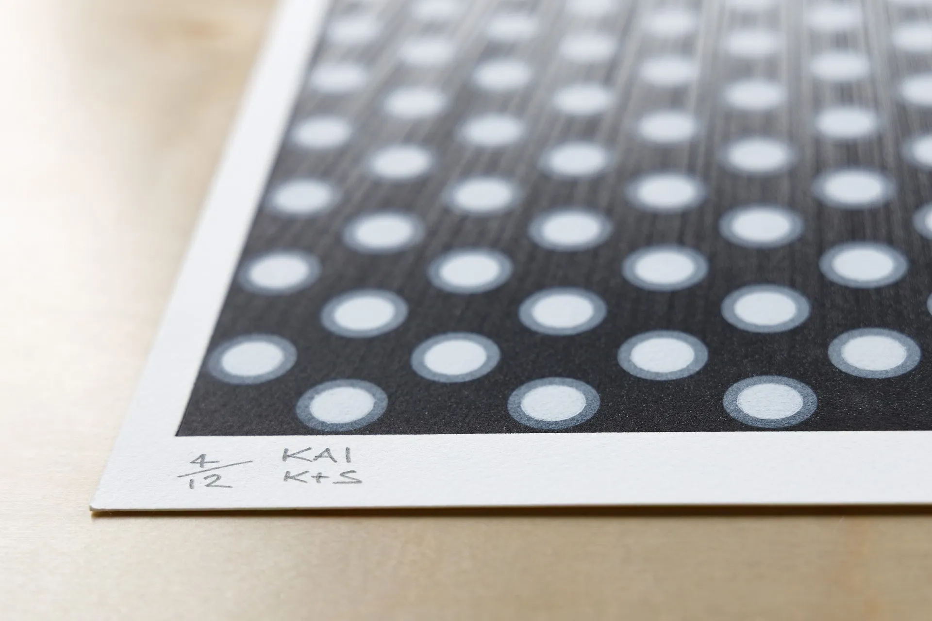
A number written in pencil at the foot of a print — 24/100, say — is one of the first things a collector learns to read, and one of the more quietly misunderstood. On a fine-art print it is the edition number, and it records two plain facts about the sheet in front of you. In an edition number such as 24/100, the first figure is the impression’s number within the print run and the second is the total size of the edition. An impression is a single sheet pulled from the matrix — the stone, plate, screen or block that carries the image; the edition size is the total number of impressions the artist authorised before the matrix was set aside or cancelled. This is the opening guide in our broader edition numbering coverage.
It helps to say at the outset what the number is not. It is not the kind of “edition” printed in the front matter of a book, which marks a publishing print run and can be reset and reprinted at will. A print’s edition number records a single hand-pulled impression within a fixed run the artist agreed to in advance. The two conventions share a word and little else, and we separate them properly further on.
Where the number sits, and how to read it
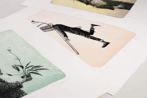
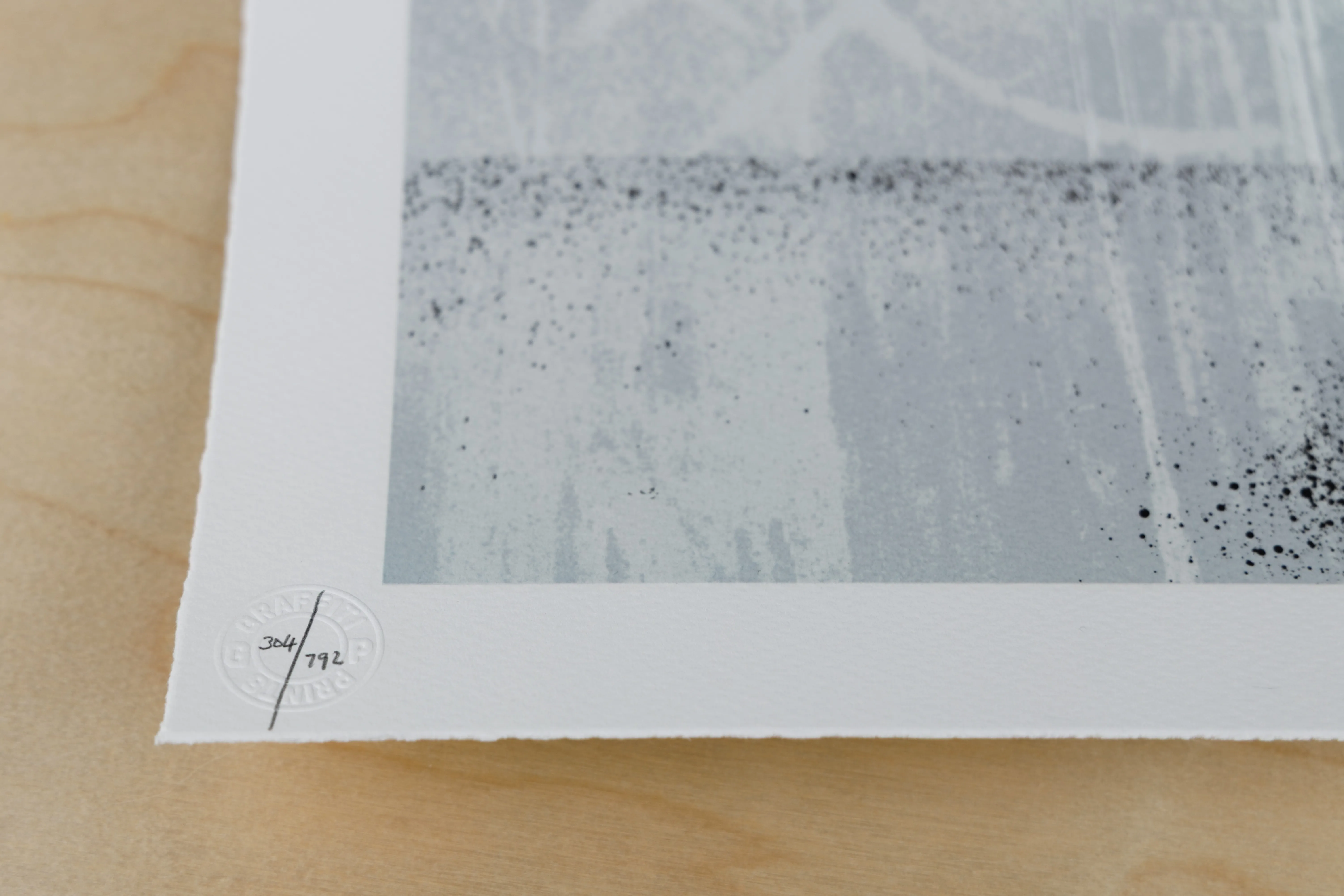
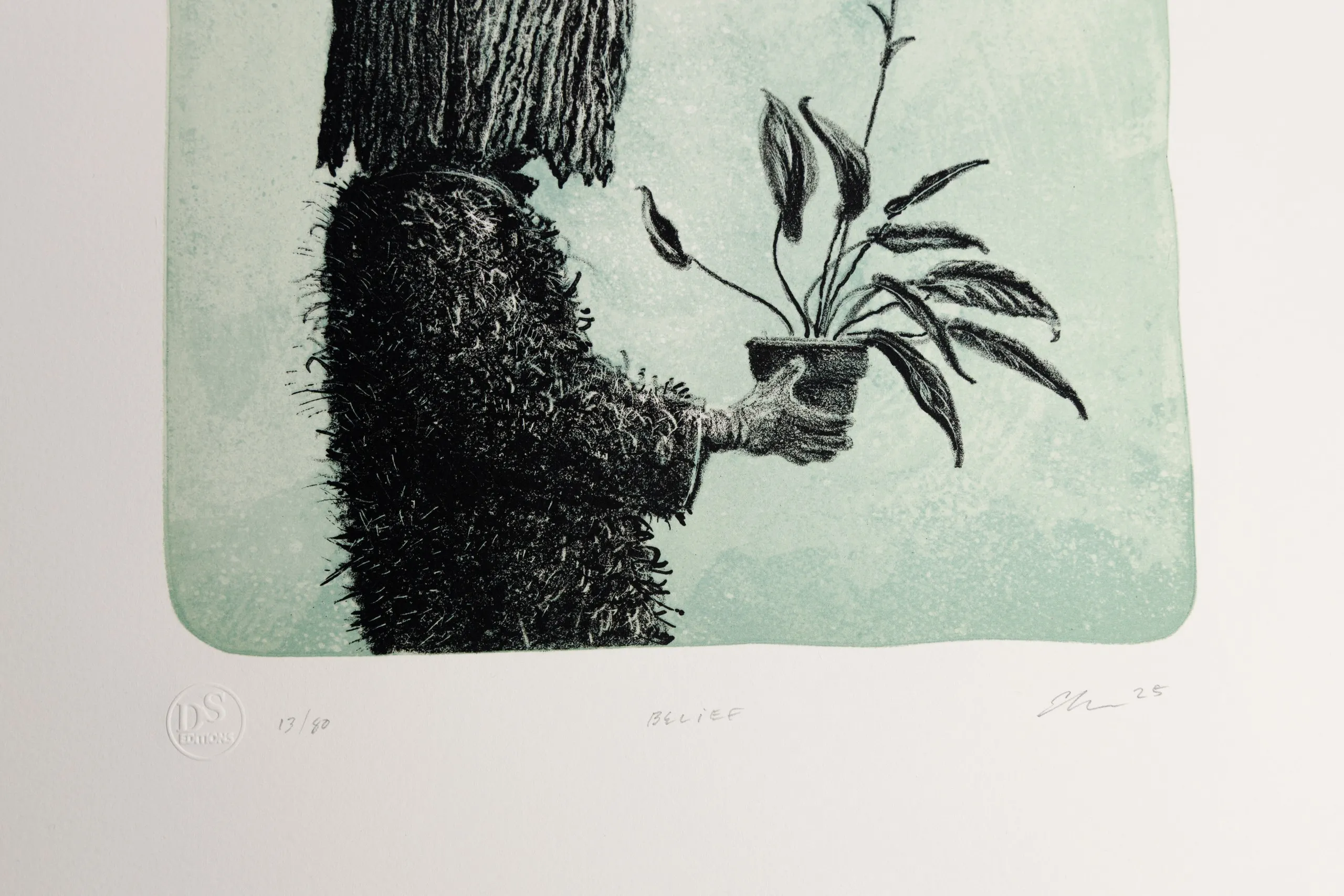
On most editioned prints the edition number is written in pencil in the lower margin, below the image, usually alongside the artist’s signature and sometimes a title. You read it as the fraction it resembles: 24/100 is the twenty-fourth impression in an edition of one hundred, 7/50 the seventh of fifty, and so on.
The common misreading is to take the first figure as a ranking — to assume 2/100 is an earlier or finer object than 84/100. As a rule it is neither. The numbering is normally applied after the edition is printed, and it does not reliably record the order in which impressions came off the matrix; nor is it a grade of quality, since the point of an edition is that the impressions are, as far as the process allows, the same. Whether the number bears on value at all is a separate question, and one worth answering carefully — we come to it below.
Why the number is in pencil
Look along the lower edge of an editioned print and the inscriptions there — the signature, the number, sometimes a title — are almost always in pencil rather than ink. This is deliberate, and it is old. By convention a fine-art print is signed in pencil, by the artist’s own hand in the margin, rather than relying on a signature printed as part of the image. The practice became established during the nineteenth-century revival of etching as an artist’s medium, and James McNeill Whistler is its standard point of reference: the University of Glasgow’s catalogue of his etchings records that he signed his plates in graphite with a small “butterfly” — his personal monogram — either as he printed them or later, when preparing them for sale.
The reasons the convention has held are practical. Graphite is stable and archival, and a pencilled inscription sits in the margin plainly apart from the printed image, so the artist’s hand-added mark is never confused with anything carried by the matrix. More to the point, a signature and number added in pencil are added by hand, after printing — they record that the artist personally handled and approved that particular sheet, not merely the image in general. That is the substance beneath the convention: pencil marks the artist’s involvement with the individual impression.
Numbering is a later and looser story than signing, and worth keeping separate. The fractional number — 24/100 — begins to appear in the late nineteenth century but does not settle into standard practice until well into the twentieth, by which time limited, numbered editions had become the norm for original prints. Sources differ on exactly when numbering became universal; what is consistent is that signing in pencil came first, as the artist’s mark, and numbering followed as editions became formally limited. A nineteenth-century etching may be signed in pencil and carry no number at all, while a contemporary limited-edition print will almost always carry both.
When you see letters instead of a fraction
Not every impression carries a fraction. Alongside the numbered edition, a small group of proofs is usually set aside, marked with letters rather than numbers, and a reader meets them often enough that they are worth knowing on sight. These are the common ones.
An artist’s proof — marked AP, or EA for the French épreuve d’artiste — is an impression kept back for the artist, outside the numbered edition but otherwise identical to it. A printer’s proof (PP) is the equivalent kept by the printer. Hors commerce (HC), literally “out of trade,” marks an impression not intended for sale, often used as an exhibition or reference copy. And the bon à tirer (BAT), “good to pull,” is the single proof the artist approves as the standard the whole edition must match; by convention there is only one per edition, and it stays with the printer as the control. Tate’s glossary describes the bon à tirer in just these terms — the proof that guides the printer.
Two things are worth taking from this. First, because proofs sit outside the numbered run, a print’s total number of impressions can be slightly larger than the figure on the fraction implies; the proofs are additional to the edition, not part of its count. Second, a letter where you expected a number is not a defect or a downgrade — it marks a proof from outside the numbered edition, not a lesser object. The fuller hierarchy of proof states, and how each bears on a particular print, is a subject in its own right, and one we will take up separately.
The same fraction, different traditions
The fraction means the same thing wherever it appears — impression number over edition size — but whether a print carries one at all, and what fixes the edition behind it, depends on the technique and the tradition it comes from. The number you read sits on top of a particular way of working.
In lithography, where the image is carried on a stone or a metal plate, editions follow the modern numbered convention, and the stone or plate is conventionally effaced once the edition is printed, so the run is closed by a deliberate act rather than left open. Screen printing works the same way for the reader — a pencilled fraction, read identically — with the stencil retired once the edition is complete. In both, the matrix is the thing that ends, and the number records a place within a run the artist chose to limit.
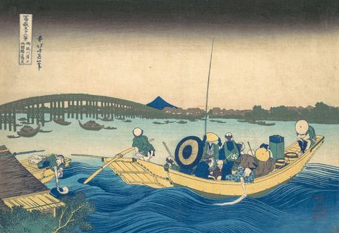
Woodcut carries the convention too, but it also reaches back to a tradition that did not number editions at all. The Japanese ukiyo-e print was a commercial object made by a team — the Victoria and Albert Museum calls it the “ukiyo-e quartet”: a publisher who directed the work, the artist who designed it, the cutter who carved the blocks, and the printer who pulled them. These prints were made cheaply and in large numbers, and are collected today as open editions rather than numbered runs. So a Japanese woodblock print may carry no fraction at all and be no less original for it — a different convention, not a missing one. We take up the woodblock tradition, and how to read it, in our guide to woodcut and its ukiyo-e lineage.
Does a lower number mean more value?
This is the question collectors ask most often about the edition number, and the honest answer begins by separating two things the question usually runs together: the impression number (the first figure) and the edition size (the second).
The impression number — whether your print is 2/100 or 84/100 — as a rule has no bearing on value. It is not a quality grade, and, as we have seen, it does not reliably record the order in which the impressions were pulled; a well-made edition is meant to be uniform from the first sheet to the last. Collectors do sometimes pay a small premium for very low numbers, or for a number that matches something personal, but that is a matter of preference rather than a difference in the object. A 2/100 and an 84/100 from the same edition are, in any meaningful sense, the same print.
The edition size is the figure that genuinely bears on scarcity. A print from an edition of fifty is, simply, one of fewer than a print from an edition of five hundred, and scarcity is one of the things the market responds to. But it is only one. What a print is worth turns far more on the artist, the particular image, the condition of the sheet, and its provenance than on the number in the margin. The edition number is a data point, not a verdict.
Two boundaries are worth stating plainly, because this is where collectors are most often led astray. First, we don’t value or appraise prints, and nothing here is investment guidance; deciding what a specific print is worth is the work of a qualified appraiser. In North America that means a member of a body such as the Appraisers Association of America, the American Society of Appraisers, or the International Society of Appraisers; in the UK and Europe, a valuer accredited by the Royal Institution of Chartered Surveyors (RICS). Second, the edition number is not proof that a print is genuine. It records a convention; it does not authenticate the work. Authenticity is settled elsewhere — by the artist’s estate or authentication authority, or by the catalogue raisonné for the artist — and it is the subject of its own argument, which we make in our essay on real prints and reproductions.
Not the “edition” on a book’s copyright page
The word “edition” does double duty, and a book’s edition is a different thing entirely from a print’s — worth holding the two firmly apart. When a book is called a first edition, or carries a row of digits on its copyright page — 10 9 8 7 6 5 4 3 2 1, say — those numbers describe the printing: which run of the press produced the copy. The string is a number line, or printer’s key, and the lowest digit present marks the printing, with the publisher dropping the lowest number at each new run. Every copy of that printing carries the same line. It is machine-printed as part of the book, set by publisher and printer, and the run can be reset and reprinted as often as the book sells.
A fine-art print’s edition number is the opposite kind of thing. It is unique to the single sheet it appears on, written by hand, and it fixes that impression’s place in a run the artist limited in advance and will not extend. One number identifies a copy within a deliberately finite edition; the other identifies which printing a mass-produced book belongs to. The exception that proves the point is the limited, signed book edition — numbered “no. 24 of 100,” sometimes by hand — which has borrowed the print’s convention for itself.
Reading a print in the hand
Put all of this together and a print’s lower margin becomes easy to read. Begin with the number, or the letters: a fraction tells you which impression you hold and how large the edition is, while a set of initials — AP, PP, HC, BAT — marks the sheet as a proof from outside that numbered run. Look to the signature, which on a modern print will be in pencil and by the artist’s own hand, set apart from the printed image. And let the edition size register for what it is — a measure of how many impressions exist, one fact among several, alongside the artist, the image, the condition of the sheet and its history, that together make a print what it is.
What the margin will not tell you is whether a print is worth a particular sum or whether it is genuine. Those are real questions, but they are answered elsewhere — by a qualified appraiser, or by the artist’s authority and catalogue raisonné — and they belong to the wider craft of collecting rather than to the number itself. The number is something quieter and more exact: the artist’s own note of where one sheet stands among its fellows. Read it as that, and you are reading it correctly. For where this guide sits, and the writing we are adding around it, turn to our edition numbering section.
FAQs
What does 24/100 mean on a print?
In an edition number like 24/100, the first figure is the impression's number within the print run and the second is the total size of the edition — so 24/100 is the twenty-fourth impression of one hundred. An impression is a single sheet printed from the matrix (the stone, plate, screen or block), and the number is written by hand, usually in pencil in the lower margin.
Why are edition numbers written in pencil?
By convention a fine-art print is signed and numbered in pencil, by the artist's own hand, in the margin and apart from the printed image. Graphite is stable and archival, and because the inscription is added after printing it records that the artist personally handled and approved that particular sheet. The practice became established during the nineteenth-century etching revival, with James McNeill Whistler as its standard point of reference.
What does "AP" or "EA" mean on a print?
AP stands for artist's proof — EA is the French equivalent, épreuve d'artiste — an impression kept aside for the artist, outside the numbered edition but otherwise identical to it. A letter where you expected a fraction signals a proof from outside the numbered run, not a lesser print. The fuller family of proofs, including printer's proofs, hors commerce and bon à tirer, is a subject we treat separately.
Does a lower edition number make a print more valuable?
As a rule, no. The impression number — the first figure — is not a quality grade; a 2/100 and an 84/100 from the same edition are, in any meaningful sense, the same print. A smaller edition size (the second figure) means fewer impressions exist, so it bears on scarcity, but that is only one factor, alongside the artist, the image, condition and provenance, which matter more. The edition number is a data point, not a verdict on value — and valuing a specific print is the work of a qualified appraiser, not something we do.
Is a print edition number the same as a book edition number?
No. A fine-art print's edition number is unique to a single hand-numbered sheet within a fixed, artist-limited run. A book's "edition" — including the number line, or printer's key, on the copyright page — designates a publishing print run, is identical on every copy of that printing, and can be reset and reprinted. The two share a word and little else; limited, signed book editions are the exception, having borrowed the print's convention.
Related materials