ARTIST
Martin Whatson
Norwegian stencil and street artist working in screen printing, with a wider practice in murals and stencil painting — and a 2022 woodblock collaboration with Tokyo's Adachi Institute.
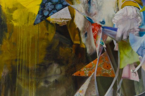
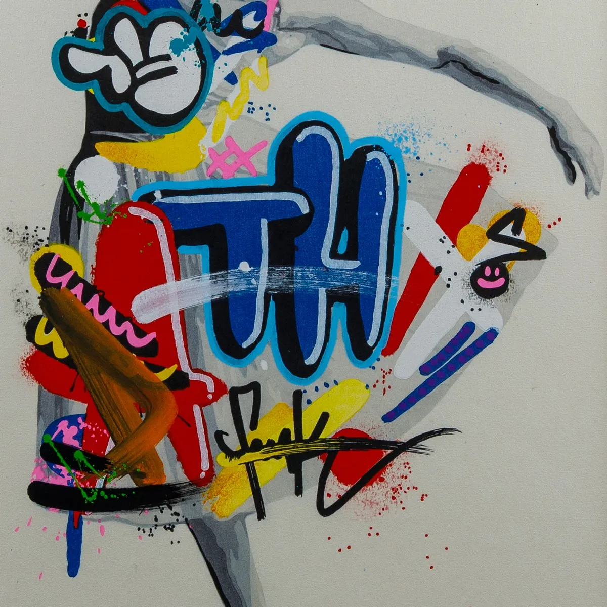
Martin Whatson is a Norwegian street artist whose signature is a staged collision: figures held in patient greyscale stencil, overrun by bursts of bright, scribbled graffiti, with neither side allowed to win. He’s known for that contrast — on Oslo’s walls, on festival murals, and in screen-printed editions — and one of the two works in the collection is exactly that: Poise, a 2026 screen print. The other, Equilibrium, is the one you wouldn’t expect: a 2022 woodblock print made with Tokyo’s Adachi Institute, where the same restless street imagery was carried into one of the oldest and most exacting printmaking traditions in Japan. Two prints, two centuries of distance between their methods, the same hand behind both.
Poise, the screen print
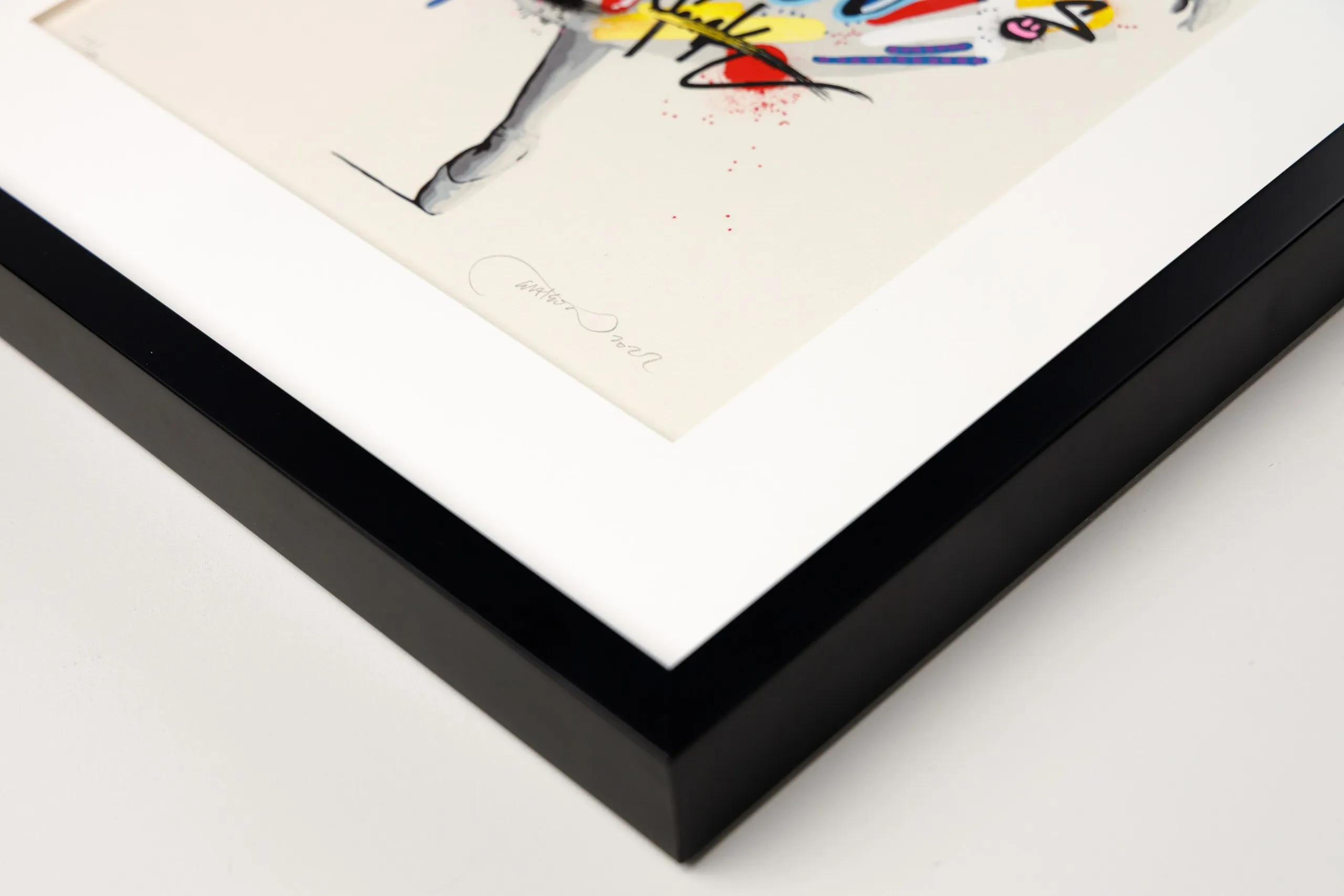
Poise (2026) is the screen print — twenty-four colours laid one over the next on a single sheet of Somerset Satin, a mould-made cotton paper from St Cuthberts Mill — a west-of-England maker that has milled paper on its site since 1736. The sheet is large, 66 × 49 cm, and signed and stamped by the artist. Twenty-four is a serious number of screens: each colour is its own stencil and its own pass, registered over the last, so the greyscale figure and the bright scribble breaking across it are built up in layers rather than laid down at once — the flat, saturated, edge-on-edge surface that is a screen print’s signature.
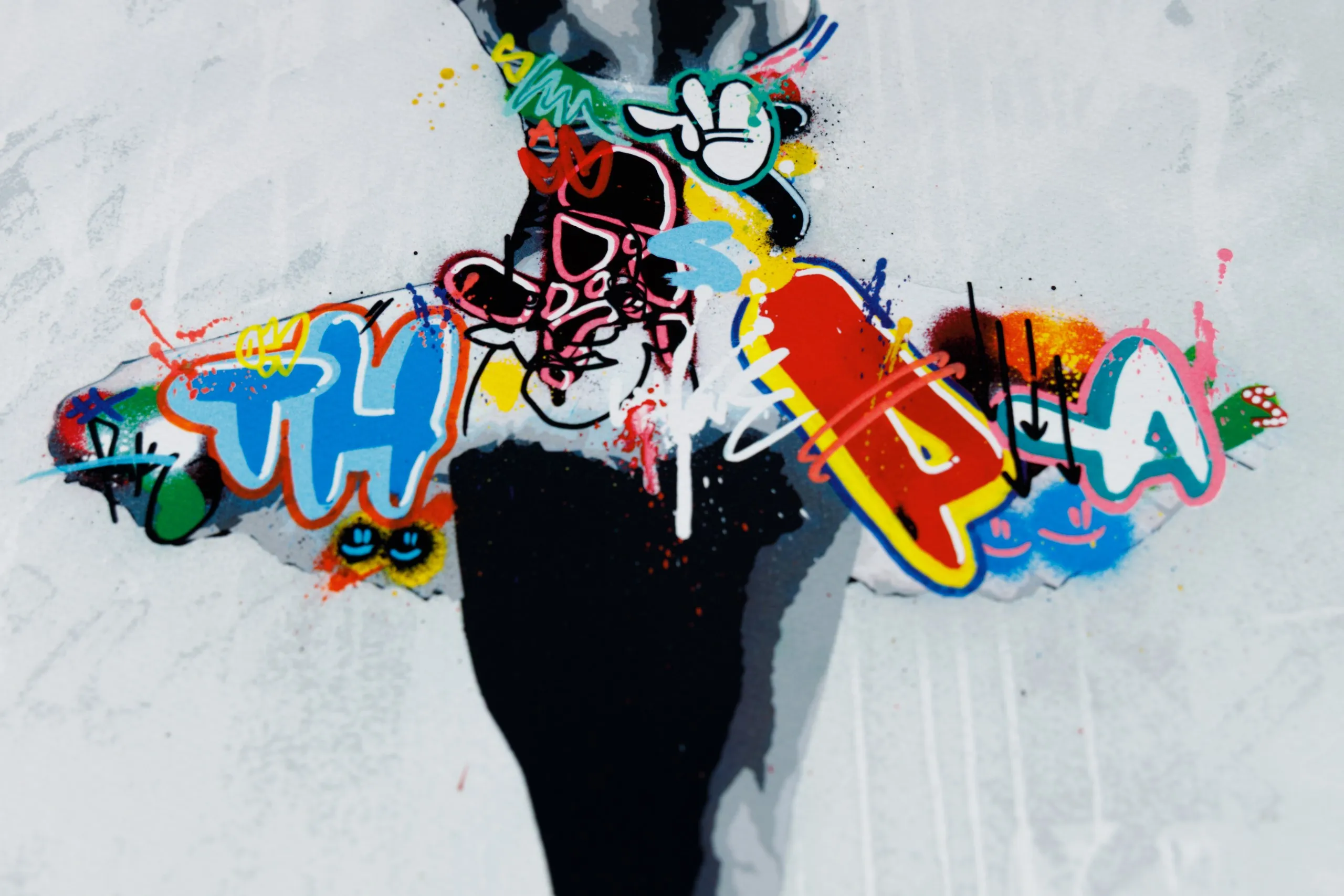
It was published by GraffitiPrints, a British print house that has produced limited editions of street art and urban contemporary art since 2012, working directly with artists to make their editions across a range of print media — screen printing among them. Poise was released as a timed edition: rather than a size fixed in advance, the run was opened for forty-eight hours and its final number — 792 — was set by how many collectors bought in during the window. That is a different instrument from the small, pre-set editions of the older print world, and a deliberate one; GraffitiPrints built its name on first-come, first-served releases at accessible prices rather than the waiting-list scarcity that hangs over much of this market. The trade-off is a larger edition; what you get for it is a signed, stamped artist’s print at the price of simply showing up.
Equilibrium, the woodblock
Equilibrium (2022) is the more unexpected of the two: Whatson’s first woodblock print, and not a woodblock in any loose sense but a contemporary ukiyo-e — an original print made in the full Japanese woodblock tradition, with the Adachi Institute of Woodcut Prints in Tokyo. The image is a dancer, one of his recurring figures, produced the way ukiyo-e have always been — a carver cutting the blocks, a printer pulling each colour by hand, water-based pigment rubbed into the sheet one register at a time. It is an edition of 150, 45 × 30 cm, signed and numbered, and when the prints came off the blocks Whatson finished each one himself by hand, so no two are quite alike. It came into the collection in 2024, when the Institute released the impressions still held in its archive.
What makes that worth dwelling on is who did the making. The Adachi Institute has worked in Tokyo since 1928, founded to keep alive the woodblock techniques that produced ukiyo-e in the Edo period; its carvers and printers have reproduced something like 1,200 of the great prints — Hokusai’s Great Wave among them — by methods essentially unchanged since the eighteenth century, and in 1994 it set up a foundation to train the next generation of artisans. Alongside that preservation work it invites living artists to make new prints in the same tradition, which is how a Norwegian stencil artist came to have his dancer carved into mountain-cherry blocks. The paper is Echizen kizuki hosho washi — handmade from paper-mulberry by Ichibei Iwano, a Living National Treasure — the sheet the Institute keeps for its finest work.
So Equilibrium holds two worlds in a single image: the restlessness of graffiti and a craft tradition that measures its standards in centuries. It is perhaps the most quietly radical object in the collection — stark, ephemeral street imagery, made to last by the slowest and most exacting printmaking there is.
Why these works are in the collection
For Paper Matters, the two Whatson prints do something together that neither does alone: between them they mark the far ends of what an original editioned print can be today. Poise is the contemporary end — a screen print made with a present-day urban-art publisher and released on a timed, demand-set model, priced to be bought rather than queued for. Equilibrium is the other end entirely — a woodblock pulled by hand in a Tokyo studio that has held to Edo-period method for nearly a century. The same restless imagery, by the same hand, carried through two print cultures that almost never meet.
That span is the reason both are here. Most artists who make editions work inside a single tradition; Whatson is one of the few whose prints let you hold two at once — the fast, public, accessible idiom of the street and the slow, exacting discipline of the Japanese woodblock. What links them, and what the collection cares about, is that both clear the same bar: each is a signed artist’s edition, made with the artist rather than merely from his image. Where the line sits between an artist’s print and a reproduction — and why a screen print belongs on the original side of it — is the subject of our longer look at screen printing.
There’s a smaller rhyme in it, too. Whatson’s pictures are built on collision — order against chaos, greyscale against colour, the figure against the scribble that breaks over it. The two prints stage that same collision one level up, in the choice of medium itself: the temporary and the permanent, the new and the ancient, held in a single body of work. It’s a clean illustration of what this publication keeps returning to — that the how of a print is never neutral, and that an artist’s choice of process is part of what the work means.
Whatson’s wider practice
The prints sit at the edge of a practice that began, and largely still lives, on walls. Whatson — born in Oslo in 1984, where he still works — studied art and graphic design at the city’s Westerdals School of Communication and started cutting his own stencils in the winter of 2004, drawn to graffiti and to the slow life of the street itself. His subject, from the beginning, has been decay: the beauty in what a city dismisses as ugly or leaves behind, the way a wall records its own history in layers. The signature that came out of it is the one in both prints here — figures held in patient greyscale stencil, then broken open by bursts of bright, scribbled colour, order and vandalism made to share a surface.
Most of that work is large and public. He paints murals and festival walls around the world — Oslo, Tokyo, London, New York — and his pieces are held in museum collections including Amsterdam’s Straat Museum and Berlin’s Urban Nation. The studio work runs alongside it: hand-cut stencils on canvas, spray paintings, and the occasional excursion outside art entirely, such as his redesign of the Norwegian furniture house Eikund’s “Krysset” chair. The gallery shows are frequent and international — among the recent ones, the 2023 solo Concrete Echoes at Harman Projects in New York.
His work is carried by galleries and print publishers across Europe, the United States, and Japan rather than a single representative. There’s far more of it than two prints can show, and the best place to see the rest is his own: martinwhatson.com keeps the murals, the studio canvases, and his current shows all in one place.
More about the artist...
Martin Whatson also mentioned in…