ARTIST
FAILE
Brooklyn artist duo working in screen printing, with a wider practice rooted in street posters, painting, sculpture and installation.
FAILE is the Brooklyn duo of Patrick McNeil and Patrick Miller, working together since 1999. Their imagery is assembled from fragments of comic books, pulp novels, religious icons and arcade graphics, layered and weathered like a street poster wall, and it began outside, as wheat-pasted posters and stencils, before moving into prints, paintings and installations. Three screen prints represent them in the collection, and they pull in opposite directions. Lumina (2025) is printed on the thin, hand-cut butcher paper FAILE use for pasting on the street. Across the Cosmos (2026), held in both its Lavender and Burgundy colourways, is the reverse: a heavy-feeling cotton sheet printed on both sides, with a full image on the front and a second, black-only image on the back. The same studio, a year apart, with two different ideas of what a sheet of paper is for.
Lumina, the street print
Lumina comes out of the part of FAILE’s practice that never left the street. For pasting, the studio prints on matte butcher paper, cuts the sheets by hand, and often stains and paints them. The prints sit around the studio, collecting the marks of the work, until they are rolled up and taken out to a wall. In 2025 the duo made a series from those street prints for collectors. Lumina is one of them: acrylic and silkscreen ink on butcher paper, 25.5 × 36 inches, in an edition of 100.
The image is mostly black and white, quieter than most of what FAILE prints, and the paper does much of the work. Butcher paper is thin and grained, and framed on a wall its texture reads straight through the image, so the surface becomes part of the picture rather than something behind it. The hand-cut edges give each sheet a slightly different line.

Both artists sign the front, and the edition number is on the back, out of sight once the sheet is framed. It is the same split the studio uses on Across the Cosmos.
Across the Cosmos, the double-sided pair
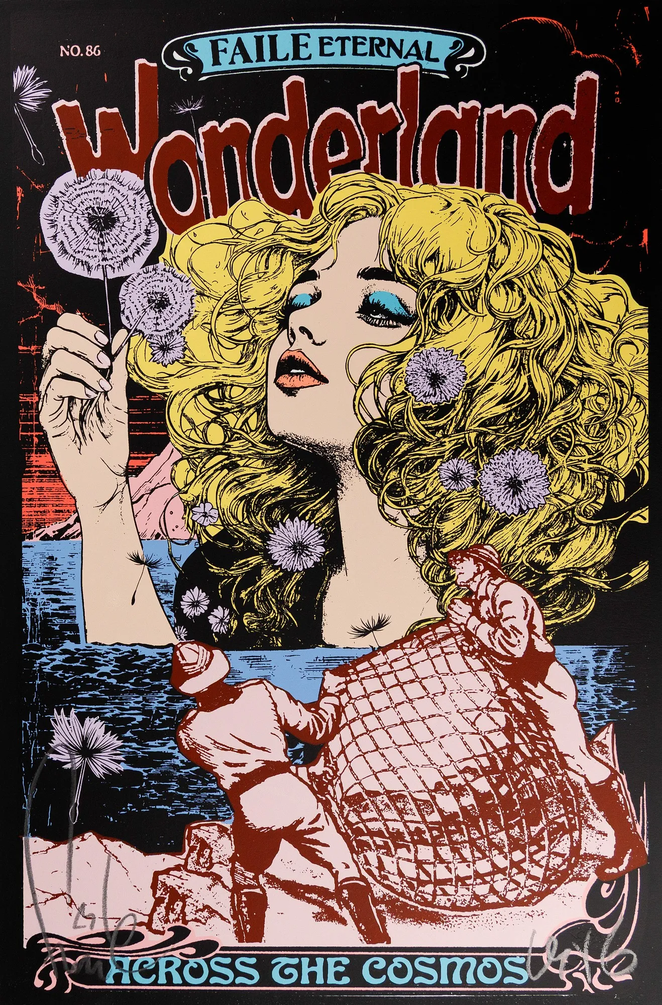
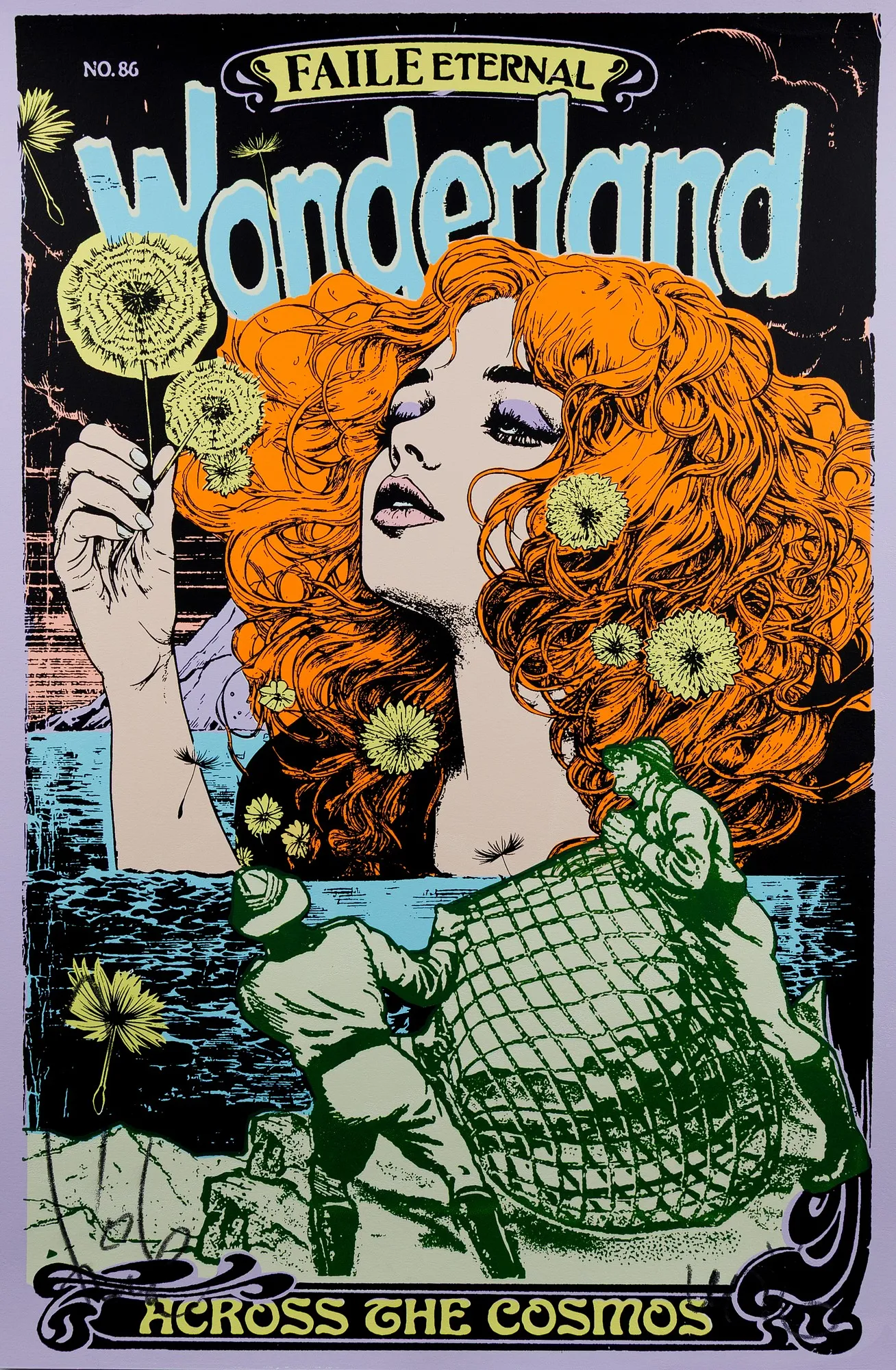
Across the Cosmos (2026) is the opposite of Lumina in nearly every material respect. It is acrylic and silkscreen ink on Lenox 100, a 100% cotton sheet that Legion Paper introduced in the early 1970s and that holds its shape well under the repeated passes of screen printing. It measures 25 × 17 inches, in editions of 50 per colourway. The collection holds two: the Lavender Version, number 34, and the Burgundy Version, number 26.
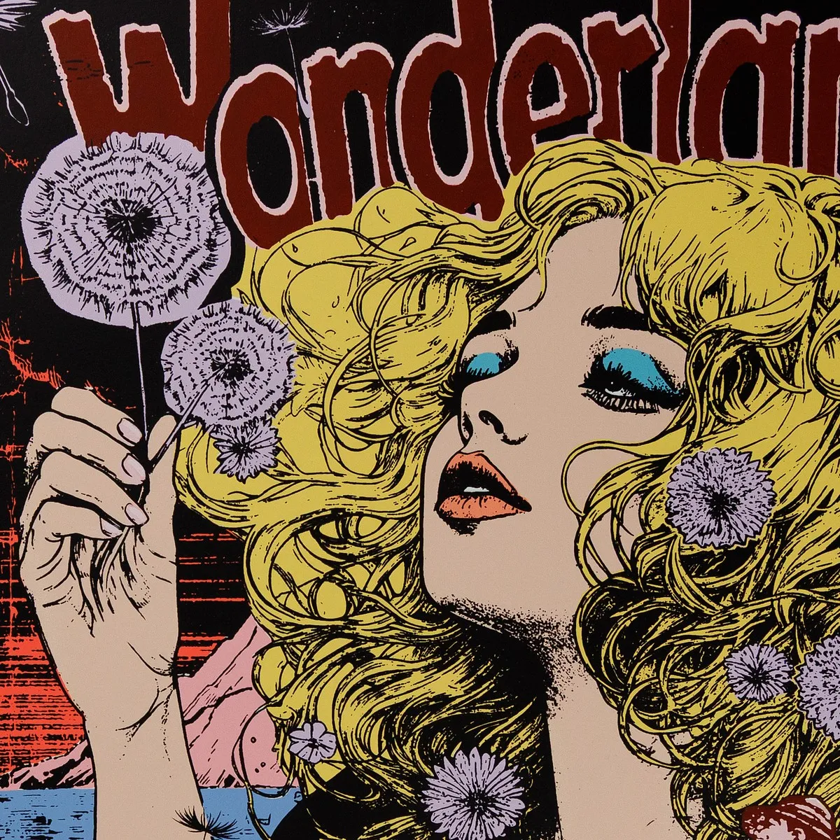
The front is staged as the cover of a pulp magazine that never existed. A banner reads FAILE Eternal, an issue number sits in the corner, and Wonderland runs across the top as a masthead. Below it, a woman with a mass of blonde curls holds a dandelion clock to her face, flowers caught in her hair. In the foreground, men haul a net up a rocky shore. Across the Cosmos closes the page in an ornamental banner of its own. Hung side by side, the two colourways read as a pair rather than a duplicate.
The surprise is on the back. Each sheet is printed on both sides, and the reverse carries a second, entirely different image in black alone: Salvation, a mock devotional advertisement. A grinning pin-up devil and a winged angel sit on either side of an old desktop computer whose screen reads Let There Be Light, all framed in roses under the promise “At Your Service!”. The front borrows from comic books and pulp covers, and the back from religious imagery and vintage advertising. Between them, the two faces of one sheet hold most of FAILE’s visual vocabulary.
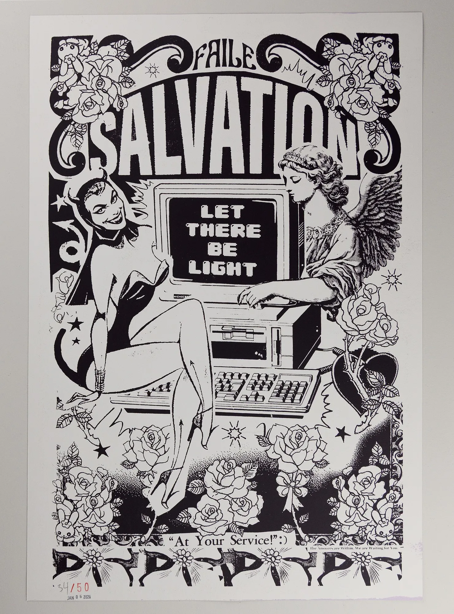
Lenox 100 is a 250 gsm sheet, not an especially heavy paper, so the weight these prints have in the hand comes largely from the ink: many colours on one face, a full image on the other.
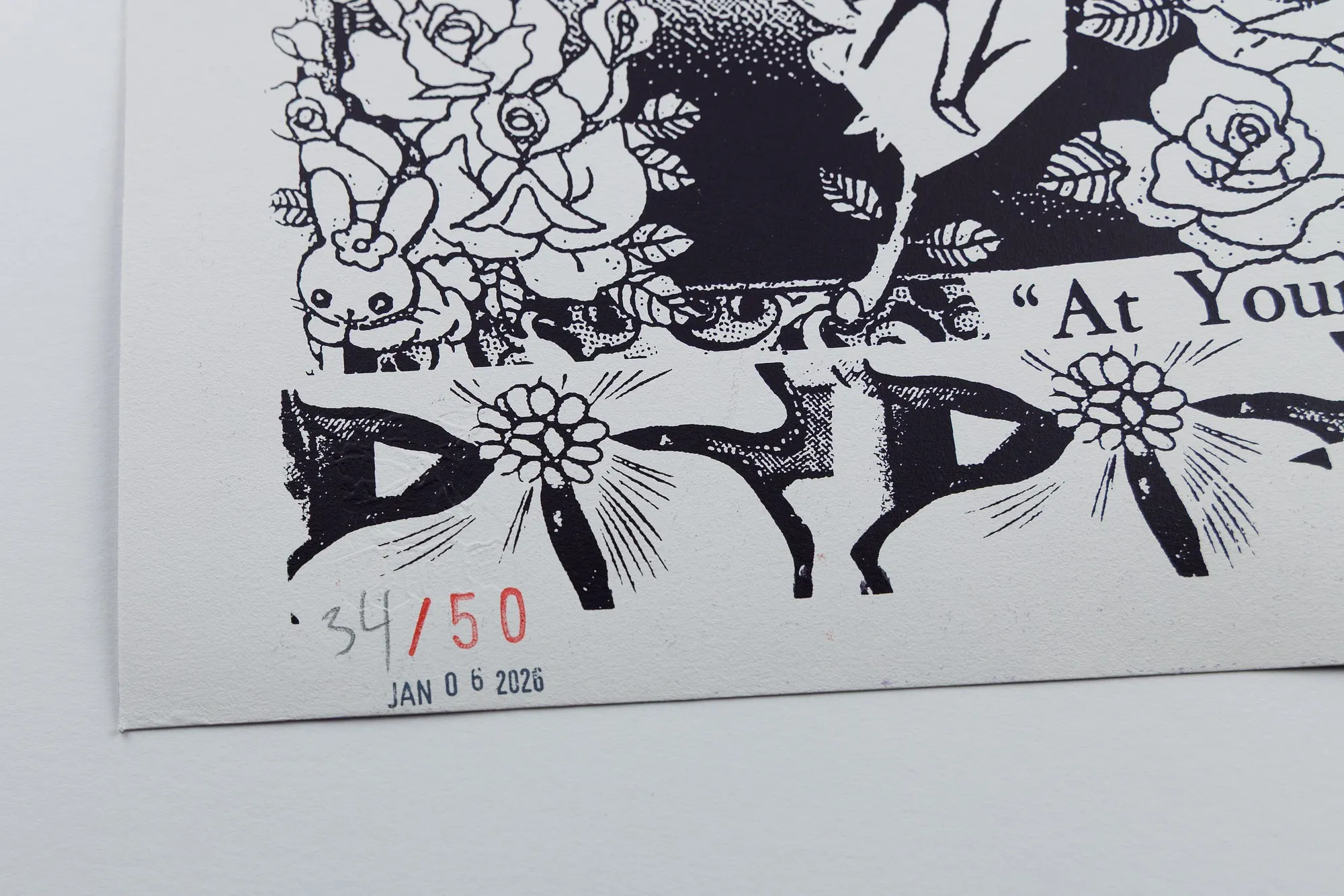
The marks are split between the two sides, and the back is where FAILE departs from convention. Both artists sign the front, over the image itself, one at bottom left and one at bottom right. The edition is not pencilled into a blank margin, as fine-art practice expects. It sits inside the artwork, in the lower corner of Salvation. The edition size is stamped in red and the date stamped beneath it, their figures slightly worn and uneven, and only the impression number is added by hand in pencil. The result looks less like a print’s notation than a docket stamped at a counter, and it suits a sheet whose back is dressed as an old advertisement. The same taste for worn type and found paper runs through FAILE’s work from the street onward.
Why these works are in the collection
The collection’s history with FAILE is older than any of these prints. Close to twenty years ago, the duo made a skateboard for a benefit show at the Atlanta gallery Paper Matters’ founder ran until 2008. The show raised money for a local skatepark and brought together local artists with better-known names, Shepard Fairey among them. The board sold during the show. The interest it started stayed, and FAILE’s work has been followed closely ever since. All three of these prints came in that way: bought on release, directly from the studio.
What decided these three was the process. Each is a screen print, the medium FAILE’s street work was built on, in which their layered imagery is made rather than reproduced. Between them, they mark the two ends of what FAILE do with paper. Lumina keeps the street sheet itself, thin and hand-cut, carrying its texture into the frame. Across the Cosmos goes the other way: an archival cotton sheet worked on both faces, with its edition stamped into the art. One remembers where the work came from. The other shows how far the studio’s printmaking has travelled since.
What the collection looks for in a print is evidence of how it was made. With FAILE, that evidence is everywhere: in the grain of butcher paper under the ink, in two images pulled through one sheet, in stamped figures that came out slightly worn. All of it comes from the printing itself, and following it back is the best way into how screen printing works and why the process shapes what ends up on the wall.
FAILE’s wider practice
Patrick McNeil, born in Edmonton, Alberta, in 1975, and Patrick Miller, born in Minneapolis in 1976, met as teenagers in Arizona and found each other again in New York in the late 1990s. They began as a trio with Aiko Nakagawa, who left in 2006 to work on her own as Lady Aiko, and took their name from an anagram of their first project, A Life. The early work was small and close to the ground: stencils and wheat-pastes in alleyways, on billboards and kiosks. Out of it came a cast of recurring characters, including pulp heroines, wolves, surfing horses and space shuttles, that became the duo’s own folklore.
The practice moved indoors without leaving the street behind. FAILE now work across printmaking, painting, sculpture and installation, including arcade-inspired environments, and describe their process as “bringing the outside in and the inside out.” Their work has been shown at the Brooklyn Museum, Tate Modern, Lincoln Center and Dallas Contemporary, and in Times Square. In September 2025 the STRAAT Museum in Amsterdam, a city where they have worked on the street since the early 2000s, opened FAILE: Between the Sheets. The 26-year look back returned to the paper medium of their early years and ran until January 2026, in the same year Lumina was released.
FAILE’s own site is the place to follow the studio, from new work to the next print release. Releases are also announced through the studio’s newsletter, which is how all three of these prints came into the collection, and it’s worth joining if you’d rather meet the next edition on release than on the secondary market.